#but i ended making a full gifset
Explore tagged Tumblr posts
Text


"Sakai often petted the camels to express his gratitude to them. At one point, he petted one so much that a camel spat on him at full blast." --From Drum's Secret Investigation File (Vivant Live Broadcast 2023.09.10)
#vivant#sakai masato#nogi yusuke#drum vivant#tomisakae drum#vivant jdrama#jdramaedit#jdramasource#asiandramasource#sakoda takaya#yamamoto takumi#my gif#translation#mine mine#camel#vivant live broadcast#dude over here getting bullied for something he did for his role lol#you know i originally was planning just 3 gifs for this#but i ended making a full gifset
23 notes
·
View notes
Text
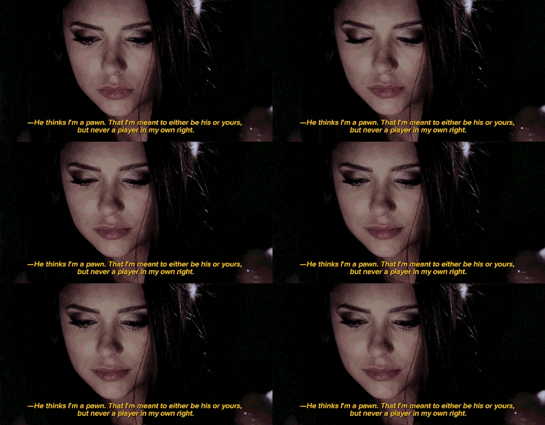
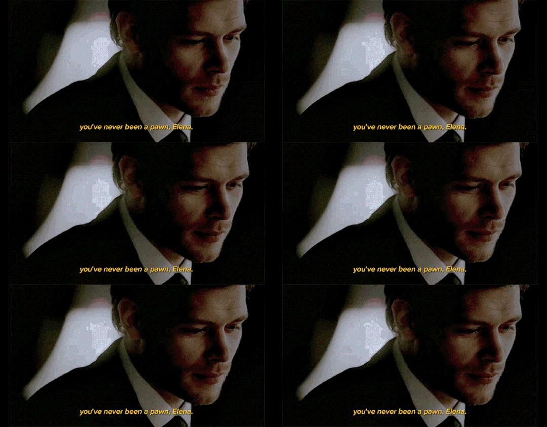
It's an admission that even Klaus still thinks about their past.
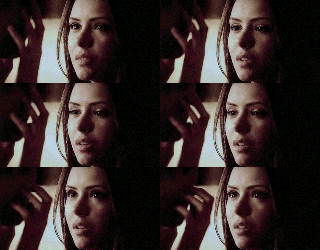
She doesn't know why she kisses him, just then. Maybe to say- thank you.
Fairytale Ending, Chapter Sixty-Two
by @livlepretre
#IM BACK#was in the middle of a job interview when i received the notif about the update and ngl my brain malfunctioned#eating up every bit of klaulena crumbs as always#3 days later and my mind is still full of this scene so i had to make a quick gifset for it :33#fairytale ending#edit#klaulena#klena
110 notes
·
View notes
Photo


Jamie and Ariel in You, Me and the Apocalypse | 1x08: Saviour Day
#ymataedit#ymata#you me and the apocalypse#ariel conroy#jamie winton#ariel x jamie#mat baynton#mathew baynton#userireland#*#*mat#their faces#their necks#ariel's insane eyes vs jamie's full of tears#the unhinged glee vs the absolute fear#and the absolute intensity in their gazes#oughhougghough#these two will be the end of me!!#have i giffed this before? yes. will i continue to gif this? most probably#this scene will def be used again when i make my ariel/jamie ocd parallels gifset#at LEAST#(whenever that is. it WILL happen though mark my words)
45 notes
·
View notes
Text

they r working out their polycule schedule
#and when I make a full rvb canon moments gifset what then#➤ roger collins & victoria winters & burke devlin. ┊ to know how it ends‚ and still begin to sing it again.
4 notes
·
View notes
Text
Okay I finally had time today to finish watching your video and my god thank you!!!
You perfectly explained all of the reasons I dropped Only Friends half way through and only watched the specific scenes lots of the fandom talked about after that. The fandom had way more to do with why I dropped it than anything the show ever did and it only got worse the longer the show went on.
Like you explained in the video, I also had figured out towards the beginning of the show that it likely wasn’t going to be as messy as we all wanted it to be (myself included) but I still settled for a good ride and for Jojo and Den and Ninew to tell as true a story as they could (and I think they succeed) but watching the fandom take a tail spin into anger made me want to watch it less and less, to the point where I tried to stay off tumblr as much as I could the day the finale aired because I KNEW the reactions were going to be bad. Now watching some people go after Jojo like they go after Mame has just made me never want to interact with some people ever again. It’s frustrating and I love so many people in this fandom so I mostly tried to stay quiet about my dislike of it.
P.S. The stuff about TopMew and ForceBook. Couldn’t agree more. I like TopMew more than most I think (because I love the bickering married couple trope I’m not sorry) but the fact that there were times (from what I watched and other specific scenes from the episodes I didn’t) that I genuinely wondered why they were together and why they shouldn’t break up and the awkward chemistry is a testiment to ForceBook and abilities and yet people just went after them and the people who liked them and just made me go “big yikes” and also “please don’t do that” (also would like to echo that MJ please don’t delete your account I love you so much)
P.P.S. thank you for the stuff about pathologizing characters and especially about whether or not actions should be considered abusive or not. While you were speaking specifically to OFMD (which I have not seen) as well as your own experiences, it also spoke to me with regards to the way some of the fandom has treated Ray in OFTS. Week after week I would have sit and try to calm myself down after the show aired because of it. Because no he does not react well when things don’t go his way and yes he will resort to insulting/mistreating people he does genuinely care about when he is upset and he will absolutely say things he does not mean and will later regret but he does it anyway because he has no better way of expressing himself. While I do not think he has ADHD and the often resulting RSD, he definitely has trauma (likely stemming from parental neglect) that makes him react the way someone with ADHD (and RSD) would. In my most bitter moments, I sat here and just went “tell me you’ve never suffered from low self worth/self esteem, depression and suicidal ideation or never suffered parental neglect of any kind without telling me you’ve never suffered those things” because it felt like so many people were invalidating my own lived experiences and calling me abusive for also having done some of those things. (Because ADHD/RSD and depression/anxiety/passive suicidal ideation are a bitch of a combination I wouldn’t wish on my worst enemy). Ray’s lived experiences with his mental health and parental situation (at least in terms of parental neglect) are pretty similar to my own (barring addiction) and watching other people simplify it and call him abusive towards others (especially Sand) to justify why they don’t like him or why they think another character has the moral high ground above him (which they do not, that’s the whole fucking point of the show) felt a lot like people telling me that they have the moral high ground on me and I’m a terrible person for having suffered those things and having reacted in similar ways to him. Ray might not be a perfect character and he does treat a lot those around him like crap because of his issues, which is not okay, but the fact that he gets help towards the end and hopefully starts becoming a better version of himself makes me feel hope for my own continued work on myself but seeing so many people just continue to shit on him makes me even more scared to interact with people in the fandom then I already was because what if they realize I can be like that too and thus decide they don’t want to know me at all?
youtube
made a video dissecting Clexa, Izzy's death, the messy ending of Only Friends, and Gaylors. please pray for me 🙏
#anyway i’m going to stop there because this rant is too long#sorry about that#but yeah#ray isn’t perfect but damn do i feel seen by him#getting way too personal here but yeah#so much of how i interact with people is informed by my belief that i am worth nothing#even though i know intellectually that that is wrong and i am worth something#the most extreme of the reactions in here throw me back to that place i was at when i was ray’s age#so yeah#that’s why i dropped only friends#i tried to keep interacting for a while#reading meta and reblogging gifsets and stuff#but eventually it became too hard to do that#have kind of started again now that it’s over#just being happy that ray got to be happy at the end#and hopefully improving himself#because it gives me hope for myself#ray is not a good™️ or special™️ but he does make me feel seen in a way#anyway idk how to end all of that#sorry again for the long ramble#i think i just needed to get it out#feel free to tell me to delete it if you need me too#i’m not sure exactly what my point is even supposed to be#hahaha#all that being said#very good video#everyone go watch the full video#please
120 notes
·
View notes
Text
My GIF Making process: Screen capturing using MPV player, Organizing files, 3 Sharpening settings, Basic Coloring PSD + Actions set

This is a very long post so heads up.
I’ll try to be as thorough and true as much as possible to the way I make my gifs (I already use Photoshop Actions which I’ve long since set up but now for this tutorial I’m reviewing them to show you the exact steps I’ve learned to create my gifs 😃) and present them to you in a semi-coherent way. Also, please bear with me since English is my second language.
First things first. Below are the things and tools we need to do this:
Downloaded 4K or 1080p quality videos (let’s all assume we know where to get these—especially for high definition movies and tv series—so this post doesn’t get removed, okay? 😛)
Adobe Photoshop CC or the CS versions can work as well, but full disclosure I haven’t created gifs using the CS versions since 2020. I’m currently using Adobe Photoshop 2024.
mpv player. Use mpv player to get those frames/screenshots or any other video player that has a screen grabber feature. I’ve used adapter for the longest time but I’ve switched to mpv because the press to screenshot feature while the video is playing has been a game changer not to mention ultimate time saver for me. For adapter you need to play it in another video player (like VLC player), to get the start and end timestamps of the scene you want to gif which takes me ages before I can even open Photoshop.
Anyway! Please stop reading this post for a moment and head over to this amazing tutorial by kylos. She perfectly tells you how to install and use mpv player, both for Mac and Windows users.
One thing I have to share though, I had a tough time when I updated my MacOS to Sonoma since MPV is suddenly either duplicating frames or when I delete the duplicates the player seems to be skipping frames :/ I searched and found a solution here, though it didn’t work for me lol. My workaround for this in the meantime is decreasing the speed down to 0.70 then start screenshotting—it’s not the same pre Sonoma update but it works so I’ll have to accept it rather than have jumpy looking gifs.
Now, after this part of kylos’ tutorial:

you can continue reading the following sections of my gif tutorial below.
I want to share this little tip (sorry, this will only cater to Mac users) that I hope will be helpful for organizing the screenshots that MPV saved to the folder you have selected. Because believe me you don’t want to go through 1k+ of screenshots to select just 42-50 frames for your gif.
The Control + Command + N shortcut
This shortcut allows you to create a new folder from files you have pre-selected. As you can see below I have already created a couple of folders, and inside each folder I have selected screenshots that I want to include in one single gif. It's up to you how you want to divide yours, assuming you intend to create and post a Tumblr gifset rather than just one gif.

Another tip is making use of tags. Most of, if not all the time, I make supercorp gifs so I tag blue for Kara and red (or green) for Lena—just being ridiculously on brand and all that.
Before we finally open Photoshop, there's one more thing I want to say—I know, please bear with me for the third? fourth? time 😅
It's helpful to organize everything into their respective folders so you know the total number of items/frames you have. This way, you can add or delete excess or unnecessary shots before uploading them in Photoshop.
For example below there are 80 screenshots of Kara inside this folder and for a 1:1 (540 x 540 px) Tumblr gif, Photoshop can just work around with 42-50 max number of frames with color adjustments applied before it exceeds the 10 MB file size limit of Tumblr.

Sometimes I skip this step because it can be exhausting (haha) and include everything so I can decide visually which frames to keep later on. You'll understand what I mean later on. But it's important to keep the Tumblr 10 MB file size limit in mind. Fewer frames, or just the right amount of frames, is better.
So, with the screenshot organization out of the way, let's finally head over to Photoshop.
Giffing in Photoshop, yay!
Let’s begin by navigating to File > Scripts > Load Files into Stack…

The Load Layers window will appear. Click the Browse button next.
Find your chosen screenshots folder, press Command + A to select all files from that folder then click Open. Then click OK.
After importing and stacking your files, Photoshop should display the following view:

By the way, I'll be providing the clip I've used in this tutorial so if want to use them to follow along be my guest :)
If you haven't already opened your Timeline panel, navigate to Windows > Timeline.
Now, let's focus on the Timeline panel for the next couple of steps.
Click Create Video Timeline, then you’ll have this:

Now click the menu icon on the top right corner then go to Convert Frames > Make Frames from Clips

Still working on the Timeline panel, click the bottom left icon this time—the icon with the three tiny boxes—to Convert to Frame Animation
Select Make Frames From Layers from the top right corner menu button.
So now you have this:

Go and click the top right menu icon again to Select All Frames
Then click the small dropdown icon to set another value for Frame Delay. Select Other…

The best for me and for most is 0.05 but you can always play around and see what you think works for you.
Click the top right menu icon again to Reverse Frames.
I think Photoshop has long since fixed this issue but usually the first animation frame is empty so I just delete it but now going through all these steps there seems to be none of that but anyways, the delete icon is the last one among the line of feature buttons at the bottom part of the Timeline panel.
Yay, now we can have our first proper GIF preview of a thirsty Lena 😜

Press spacebar to watch your gif play for the very first time! After an hour and half of selecting and cutting off screenshots! 😛 Play it some more. No really, I’m serious. I do this so even as early (lol) as this part in the gif making process, I can see which frames I can/should delete to be within the 10 MB file size limit. You can also do it at the end of course 🙂
Now, let’s go to the next important steps of this tutorial post which I’ve numbered below.
Crop and resize to meet Tumblr's required dimensions. The width value should be either 540px, 268px, or 177px.
Convert the gif to a Smart Object for sharpening.
Apply lighting and basic color adjustments before the heavy coloring. I will be sharing the base adjustments layers I use for my gifs 😃.
1. Crop and Resize
Click on the Crop tool (shortcut: the C key)

I like my GIFs big so I always set this to 1:1 ratio if the scene allows it. Press the Enter key after selecting the area of the frame that you want to keep.
Side note: If you find that after cropping, you want to adjust the image to the left or another direction, simply unselect the Delete Cropped Pixels option. This way, you will still have the whole frame area available to crop again as needed and as you prefer.
Now we need to resize our gif and the shortcut for that is Command + Opt + I. Type in 540 as the width measurement, then the height will automatically change to follow the ratio you’ve set while cropping.
540 x 540 px for 1:1
540 x 405 px for 4:3
540 x 304 px for 16:9
For the Resample value I prefer Bilinear—but you can always select the other options to see what you like best.
Click OK. Then Command + 0 and Command + - to properly view the those 540 pixels.

Now we get to the exciting part :) the sharpen settings!
2. Sharpen
First we need to have all these layers “compressed” intro a single smart object from which we can apply filters to.
Select this little button on the the bottom left corner of the Timeline panel.


Select > All Layers
Then go to Filter > Convert for Smart Filters
Just click OK when a pop-up shows up.
Now you should have this view on the Layers panel:

Now I have 3 sharpen settings to share but I’ll have download links to the Action packs at the end of this long ass tutorial so if you want to skip ahead, feel free to do so.
Sharpen v1
Go to Filter > Sharpen > Smart Sharpen…
Below are my settings. I don’t adjust anything under Shadows/Highlights.
Amount: 500
Radius: 0.4
Click OK then do another Smart Sharpen but this time with the below adjustments.
Amount: 12
Radius: 10.0

As you can see Lena’s beautiful eyes are “popping out” now with these filters applied. Click OK.
Now we need to Convert to Frame Animation. Follow the steps below.
Click on the menu icon at the top right corner of the Timeline panel, then click Convert Frames > Flatten Frames into Clips
Then Convert Frames > Convert to Frame Animation
One more click to Make Frames From Layers
Delete the first frame then Select All then Set Frame Delay to 0.05

and there you have it! Play your GIF and make sure it’s just around 42-50 frames. This is the time to select and delete.
To preview and save your GIF go to File > Export > Save for Web (Legacy)…
Below are my Export settings. Make sure to have the file size around 9.2 MB to 9.4 MB max and not exactly 10 MB.

This time I got away with 55 frames but this is because I haven’t applied lighting and color adjustments yet and not to mention the smart sharpen settings aren't to heavy so let’s take that into consideration.
Sharpen v1 preview:

Sharpen v2
Go back to this part of the tutorial and apply the v2 settings.

Smart Sharpen 1:
Amount: 500
Radius: 0.3
Smart Sharpen 2:
Amount: 20
Radius: 0.5
We’re adding a new type of Filter which is Reduce Noise (Filter > Noise > Reduce Noise...) with the below settings.

Then one last Smart Sharpen:
Amount: 500
Radius: 0.3
Your Layers panel should look like this:

Then do the Convert to Frames Animation section again and see below preview.
Sharpen v2 preview:

Sharpen v3:
Smart Sharpen 1:
Amount: 500
Radius: 0.4
Smart Sharpen 2:
Amount: 12
Radius: 10.0
Reduce Noise:
Strength: 5
Preserve Details: 50%
Reduce Color Noise: 0%
Sharpen Details: 50%
Sharpen v3 preview:

And here they are next to each other with coloring applied:
v1

v2

v3

Congratulations, you've made it to the end of the post 😂
As promised, here is the download link to all the files I used in this tutorial which include:
supercorp 2.05 Crossfire clip
3 PSD files with sharpen settings and basic coloring PSD
Actions set
As always, if you're feeling generous here's my Ko-fi link :) Thank you guys and I hope this tutorial will help you and make you love gif making.
P.S. In the next post I'll be sharing more references I found helpful especially with coloring. I just have to search and gather them all.
-Jill
#tutorial#gif tutorial#photoshop tutorial#gif making#sharpening#sharpening tutorial#photoshop#photoshop resources#psd#psd coloring#gif coloring#supercorp#supercorpedit#lena luthor#supergirl#my tutorial#this has been a long time coming#guys. i'm BEGGING you. use the actions set - it was a pain doing all this manually again ngl LMAO#i've been so used to just playing the actions#so this has been a wild refresher course for me too 😆
507 notes
·
View notes
Text

hello and welcome to my tutorial on how to create gifs like this one! full explanation under the cut, but if you wanted to take a little peek at the gifset attached to this tutorial, here ya go!
for the purposes of this tutorial i am assuming you know
how to make a gif
what vhs footage looks like
STEP ONE: MAKING YOUR GIF
choose your footage and plug it into your desired software of choice! i use photoshop for this so i can only attest to the efficacy of these methods in that context
as for shot selection, you could feasibly choose anything. however, i prefer shots without too much movement in them - makes it look more like a home video.
because of the heavy amount of colors and filters, i'd recommend a gif somewhere around the 40-50 frames! but of course you can play around.
oh i also set the frame delay to 0.08 seconds. this is slower than most gifmakers tend to set theirs, but it makes it run buttery smooth imo.
STEP TWO: MAKING THE COLORING
here's where we get vhs specific. if you're unfamiliar with vhs footage, i recommend clicking through this youtube playlist! if you're not interested in the coloring, skip to step three (smart object fuckery + filters)
now while making a set i tend to choose some primary colors for my gifs. in the gifset i linked above, i chose to work with blue and orange-y yellow. in some of the other gifs i'll be using as examples (from an unfinished set) i chose green and yellow.


to create the above coloring i generally use these steps:
1) curves
i'm a maniac so i use the same curves layer to initially edit the luminosity AND colors of my gifs. the purpose of this layer is to edit brightness/contrast like i normally would and already start the process of changing the colors a little bit. this is my curves layer for the blue house gif:

to make the gif go from the left image to the right image:


as you can see i used the brightening curves to make the footage a whole lot lighter. i also increased the reds to get rid of the cyan tint a lot of blue footage has, slightly increased the blues, and once again decreased the greens to get rid of any cyan. this does make the blue hue a bit more purple, which is a nice bonus!
as for the gif of the boy, that one's a little harder to show a before and after for, but i'lls how the curves for good measure:

the original shot was already quite bright so i only edited the brightness a litttle bit. because i knew i wanted the gif to be green and yellow, i increased the greens, decreased the reds (except in the shadows), and decreased the blues (to get yellow)
2) channel mixer
now the channel mixer layer takes a little getting used to so i recommend experimenting. ALWAYS USE THIS LAYER ON THE COLOR BLENDING MODE for a more even result.
i use channel mixers to sort of... unify the colors a bit more. for the house gif, for example, i increased the blue channel to +110% blue, but decreased the blue in the red (-12%) to retain the yellow in the window.
if you want me to explain this more in depth, send an ask! it'll be kinda longwinded though


before / after of the boy gif with curves/channel mixer.
3) levels
this is where it starts looking more vhs-y! vhs footage has light shadows and dark highlights.
first, set your levels layer to luminosity blending mode to retain your beautiful colors.
then, crunch the hell out of your gif to make it very... mid.


this may feel a little wrong at first but i prommy it'll look okay at the end. a before/after for the boy:


now that's starting to look familiar right?
4) color fill/gradient map
because i want to unify my colors/make sure my gif is saturated, i usually add either a color fill or gradient map layer. in the case of the house, i chose to go with a dark blue color fill:


because the coloring of the boy gif was a little more complex, i decided to go with a brown to green gradient map.

this will make the shadows yellow, and the highlights green.


BOTH THESE LAYERS ARE SET TO OVERLAY. i usually fiddle with the opacity of them until i like it, but it's anywhere from 7% - 17% depending on what i feel like that day
5) curves (again)
this layer is probably useless but i do it anyway to make myself feel better. this is just a regular curse layer to up the brightness a tiiiiny bit and amke sure everything's clear. also it helps counteract the darkness your overlay color will add in.
6) color balance
this is my most subtle layer so i won't be able to show before and after but i fiddle with the color distribution a little until i'm satisfied. set this layer to color blending 'cause that's what you wanna affect!
i decided i wanted the house gif shadows to be a little more purple, for example, so i added in red (+3), magenta (-1) and blue (+1). etc etc. do what feels good!
STEP THREE: SMART OBJECT FUCKERY AND FILTERS
OKAY that was a lot. sorry or you're welcome. but good news: now's the fun part. convert your animation to a timeline, then select both your coloring and gif layers, right click, and select convert to smart object.
now that your gif's a smart object, i usually crop it. i tend make vhs aes gifs a 4:3 ratio (so 540 x 405 px) because that's what vhs footage was usually recorded as! crop your gif, resize, and then we can continue.
1) color bleeding
vhs footage usually bleeds its colors - this manifests as a short of... weird subtle halo around any object. the way to recreate this in photoshop is to duplicate your smart object.
set your copied smart object to color blending. now move it to the side a couple of pixels (i usually do around 5px, but you do you!)


as you can see, the tree and chimney (and everything else but less prominently) have a yellow shadow to them. this is exactly what we want!
2) filters
now's the time to add your filters and make it look like shit (but on purpose!) first, select both smart objects and convert to smart object again. this will ensure the filters apply to all layers evenly.
i use the following filters:
unsharp mask (amt 35%, radius 4px) - this will subtly add some sharpening but only on the edges of objects
add noise (amt 7.5%, distr. uniform, not monochromatic) - this will add the signature vhs grain.
box blur (2px) - i edit this to be 75% opacity with the little arrows to the right, just to make sure you can still make SOMETHING out when you're looking at the gif. MAKE SURE THIS FILTER IS ON TOP OF YOUR NOISE FILTER. tumblr will kill your gif otherwise
4) ONE LAST THING
usually at this point i'm not happy with either the saturation or levels. (usually the levels). so on top of your smart object, add another saturation or levels layer and fuck around!
in the case of the house gif, i thought it was too bright still so i set my output levels to 13 and 216. for the boy, i thought the shadows were too dark, so i set my shadow output to 11.
BEFORE & AFTER:


aaaand that's it! thanks for reading! if you have any questions, feel free to come to my askbox, i'm always happy to explain my process. happy giffing 🥰
#gif tutorial#ps tutorial#photoshop#completeresources#allresources#giffing tutorial#vhs gif tutorial#idfk. what do you even tag for tutorials lmao
279 notes
·
View notes
Text
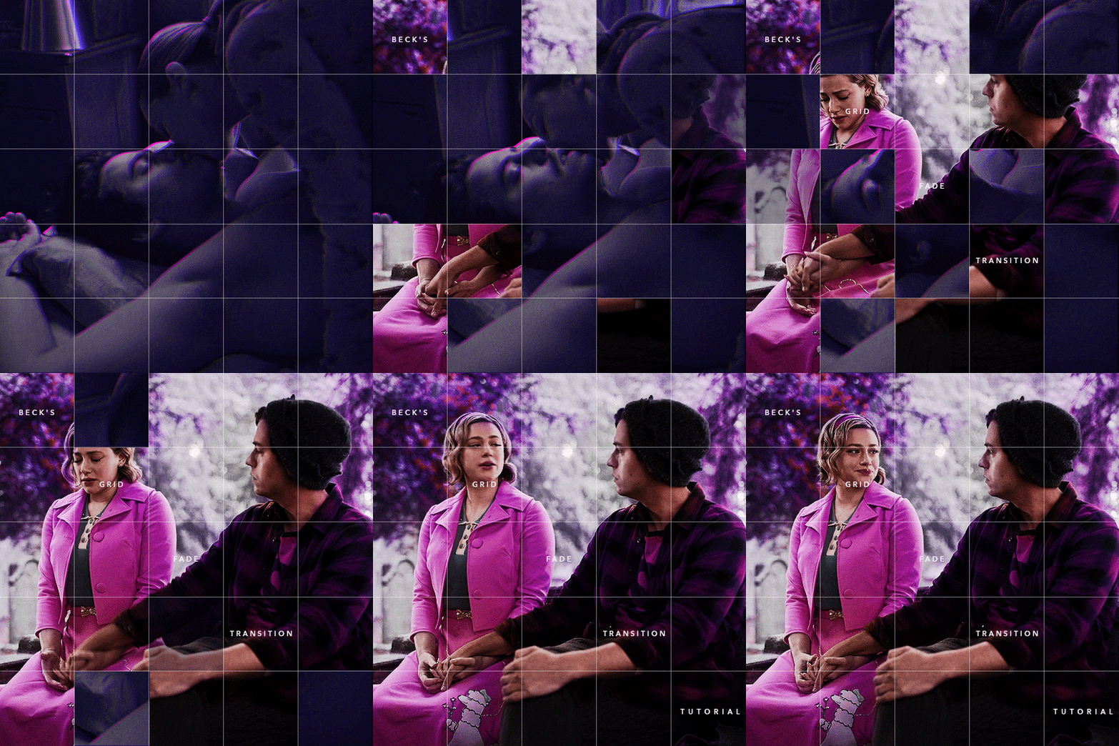
Someone asked me how I created the fade transition in this gifset which I’ll try to explain in the most comprehensive way that I can. If you've never done something like this before, I suggest reading through the full tutorial before attempting it so you know what you'll need to plan for.
To follow, you should have:
basic knowledge of how to make gifs in photoshop
some familiarity with the concept of how keyframes work
patience
Difficulty level: Moderate/advanced
Prep + overview
First and foremost, make the two gifs you'll be using. Both will need to have about the same amount of frames.
For ref the gif in my example is 540x540.
I recommend around 60-70 frames max total for a big gif, which can be pushing it if both are in color, then I would aim for 50-60. My gif has a total of 74 frames which I finessed using lossy and this will be explained in Part 4.
⚠️ IMPORTANT: when overlaying two or more gifs and when using key frames, you MUST set your frame delay to 0.03 fps for each gif, which can be changed to 0.05 fps or anything else that you want after converting the combined canvas back into frames. But both gifs have to be set to 0.03 before you convert them to timeline to avoid duplicated frames that don't match up, resulting in an unpleasantly choppy finish.
Part 1: Getting Started
Drag one of your gifs onto the other so they're both on the same canvas.
The gif that your canvas is fading FROM (Gif 1) should be on top of the gif it is fading INTO (Gif 2).

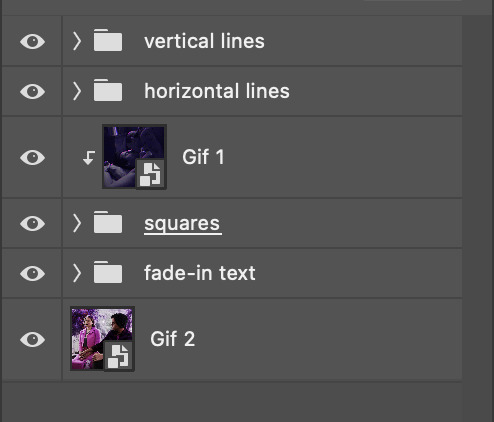
And here's a visual of the order in which your layers should appear by the end of this tutorial, so you know what you're working toward achieving:
Part 2: Creating the grid
Go to: View > Guides > New guide layout
I chose 5 columns and 5 rows to get the result of 25 squares.
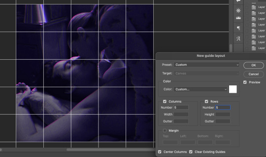
The more rows and columns you choose, the more work you'll have to do, and the faster your squares will have to fade out so keep that in mind. I wouldn't recommend any more than 25 squares for this type of transition.

To save time, duplicate the line you've created 3 more times, or as many times as needed (key shortcut: CMD +J) and move each one to align with the guides both horizontally and vertically. You won't need to recreate the lines on the edges of the canvas, only the ones that will show.
After you complete this step, you will no longer need the guides so you can go back in and clear them.

Follow the same duplicating process for the squares with the rectangle tool using the lines you've created.
Align the squares inside the grid lines. The squares should not overlap the lines but fit precisely inside them.
This might take a few tries for each because although to the eye, the squares look all exactly the same size, you'll notice that if you try to use the same duplicated square for every single one without alterations, many of them will be a few pixels off and you'll have to transform the paths to fit.
To do this go to edit > transform path and hold down the command key with the control key as you move one edge to fill the space.
Once you're done, put all the squares in their separate group, which needs to be sandwiched between Gif 1 and Gif 2.

Right click Gif 1 and choose "create clipping mask" from the drop down to mask it to the squares group. This step is super important.
After this point, I also took the opacity of the line groups down to about 40% so the lines wouldn't be so bold. Doing this revealed some squares that needed fixing so even if you aren't going dim the lines, I recommend clicking off the visibility of the lines for a moment to make sure everything is covered properly.

Part 3A: Prep For Key framing
I wanted my squares to fade out in a random-like fashion and if you want the same effect, you will have to decide which squares you want to fade out first, or reversely, which parts of Gif 2 you want to be revealed first.
In order to see what's going on underneath, I made Gif 1 invisible and turned down the opacity of the squares group.

If you want text underneath to be revealed when the squares fade away, I would add that now, and place the text group above Gif 2, but under the squares group.

Make a mental note that where your text is placed and the order in which it will be revealed is also something you will have to plan for.
With the move tool, click on the first square you want to fade out. Every time you click on a square, it will reveal itself in your layers.
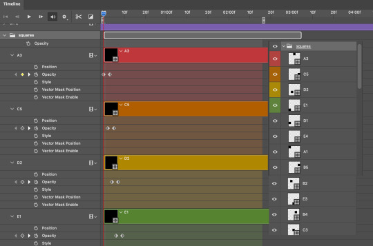
I chose A3 to be the first square to fade and I'm gonna move this one to the very top of all the other square layers.
So if I click on D2 next, that layer would need to be moved under the A3 layer and so on. You'll go back and forth between doing this and adding key frames to each one. As you go along, it's crucial that you put them in order from top to bottom and highly suggested that you rename the layers (numerically for example) which will make it easier to see where you've left off as your dragging the layers into place.

Part 3B: Adding the Keyframes
This is where we enter the gates of hell things become tedious.
Open up the squares group in the timeline panel so you can see all the clips.
Here is my example of the general pattern that's followed and its corresponding layers of what you want to achieve when you're finished:
So let’s try it!
Expand the control time magnification all the way to the right so you can see every frame per second.

As shown in Part 3A, select your first chosen square.
Where you place the time-indicator on the panel will indicate the placement of the keyframe. Click on the clock next to opacity to place your first keyframe.

Move the time-indicator over 3 frames and place the next key frame.

Things to consider before moving forward:
Where you place your very first keyframe will be detrimental. If you're using a lot of squares like I did, you may have to start the transition sooner than preferred.
If you're doing 25 squares, the key frames will have to be more condensed which means more overlapping because more frames are required to finish the transition, verses if you're only using a 9-squared grid. See Part 4 for more detailed examples of this.
The opacity will remain at 100% for every initial key frame, and the second one will be at 0%.
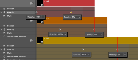
Instead of creating two keyframes like this and changing the opacities for every single clip, you can copy the keyframes and paste them onto the other clips by click-dragging your mouse over both of them and they'll both turn yellow. Then right click one of the keyframes and hit copy.
Now drop down to your next clip, move your time-indicator if necessary to the spot where the first keyframe will start and click the clock to create one. Then right click it and hit "paste".
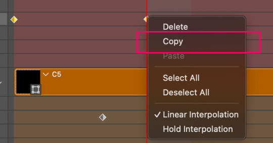
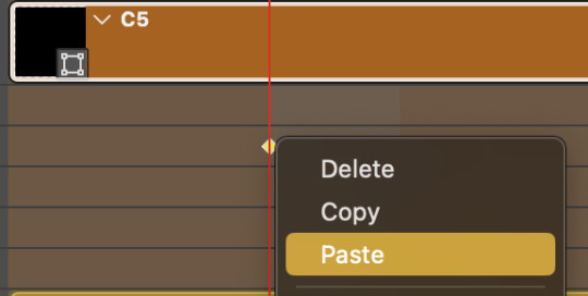
Tip: When you have both keyframes selected, you can also move them side to side by click-dragging one of them while both are highlighted.
Your full repetitive process in steps will go as follows:
click on square of choice on the canvas
drag that square layer to the top under the last renamed
in timeline panel: drop down to next clip, move time-indicator tick to your chosen spot for the next keyframe
create new keyframe
right click new keyframe & paste copied keyframes
repeat until you've done this with every square in the group
Now you can change the opacity of your squares layer group back to 100% and turn on the visibility of Gif 1. Then hit play to see the magic happen.
PART 4: Finished examples
Example 1
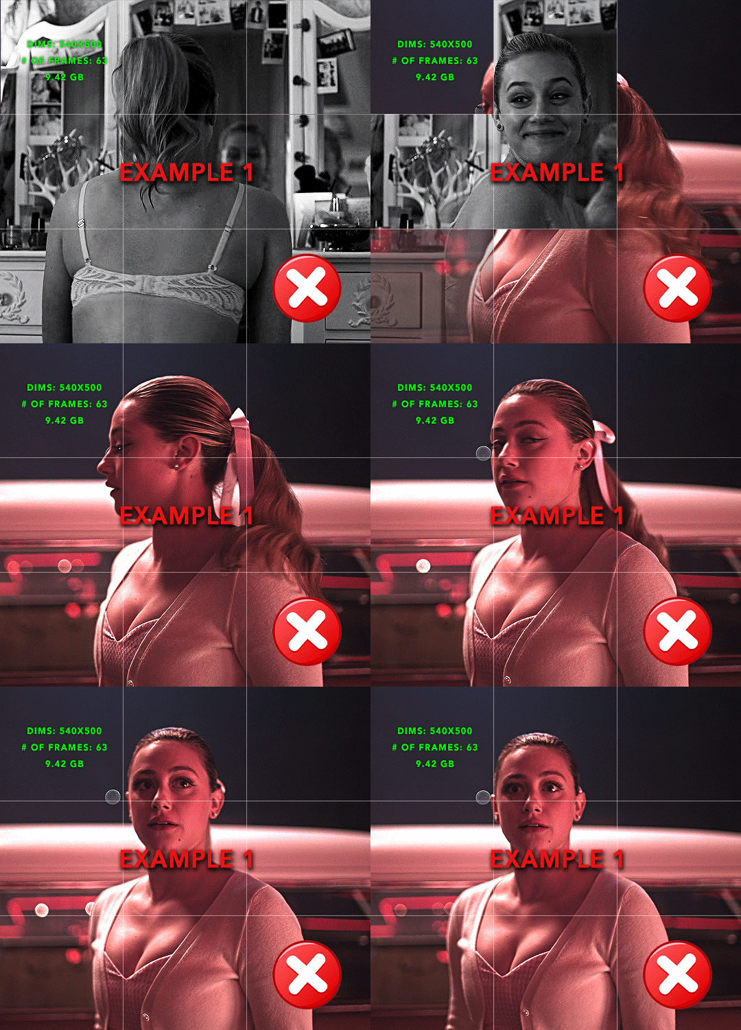
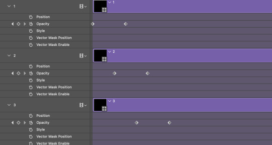
the transition starts too soon Cause: initial keyframe was placed at frame 0
the squares fade away too quickly Cause: overlapping keyframes, seen below. (this may be the ideal way to go with more squares, but for only 9, it's too fast)
Example 2
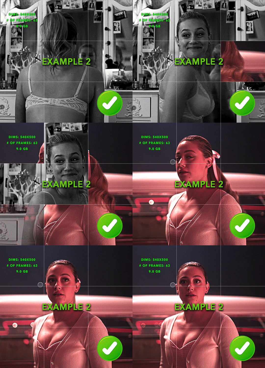
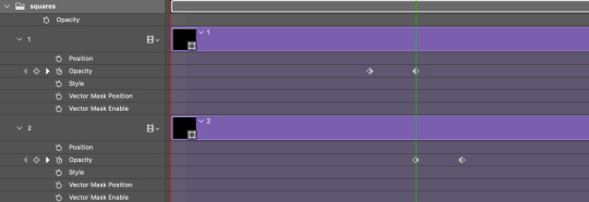
more frame time for first gif
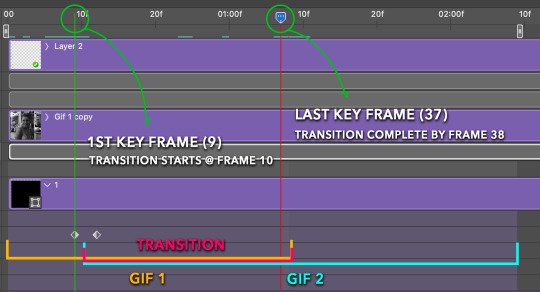
transition wraps up at a good point Cause: in this instance, the first keyframe was placed 9 frames in, and the keyframes are not overlapping. The sequential pair starts where the last pair ended, creating a slower fade of each square.
Part 5: Final Tips and Saving
You can dl my save action here which will convert everything back into frames, change the frame rate to 0.05 and open the export window so you can see the size of the gif immediately.
If it's over 10gb, one way to finesse this is by use of lossy. By definition, lossy “compresses by removing background data” and therefore quality can be lost when pushed too far. But for most gifs, I have not noticed a deterioration in quality at all when saving with lossy until you start getting into 15-20 or higher, then it will start eating away at your gif so keep it minimal.

If you've done this and your gif is losing a noticeable amount of quality and you still haven’t gotten it below 10mb, you will have no choice but to start deleting frames.
When it comes to transitions like this one, sometimes you can't spare a single frame and if this is the case, you will have to return to the timeline state in your history and condense the key frames to fade out quicker so you can shorten the gif. You should always save a history point before converting so you have a bookmark to go back to in case this happens.
That's pretty much it, free to shoot me an ask on here or on @jugheadjones with any questions.
#gif tutorial#photoshop tutorial#transition tutorial#grid tutorial#usergif#ps help#tutorials#tutorials*#resources*#requested
408 notes
·
View notes
Text
This is a little weird but I was making a gifset for the part in Doctor Who The End of Time part 2 when 10 gets trapped in that glass box and blasted with radiation and after staring at this whole scene literally frame by frame for at least an hour I HAVE THOUGHTS AND FEELINGS! So please excuse me while I break down all my favorite tiny details about this scene in excruciating detail gif by gif just because I can.
See the full gifset without commentary here.

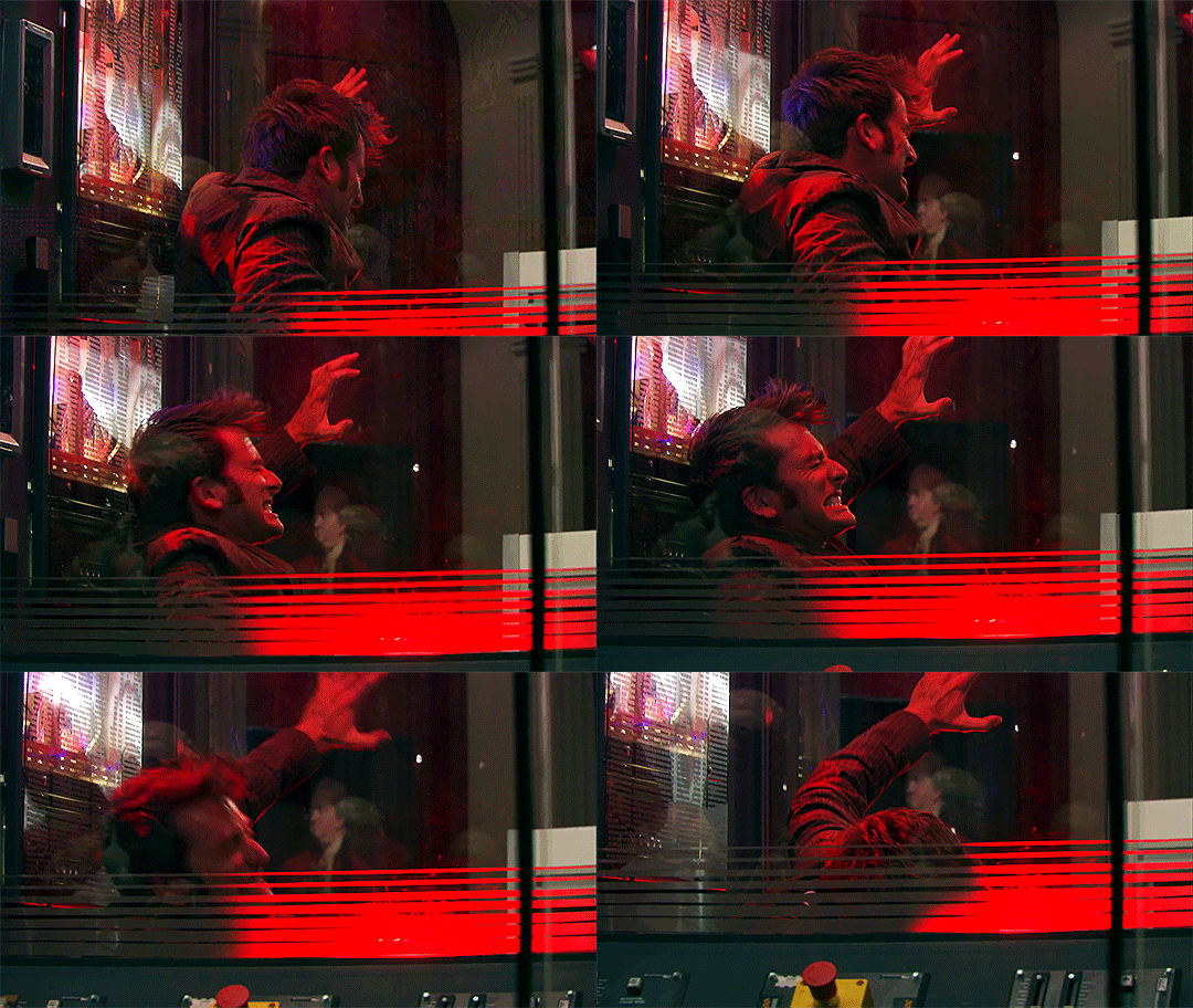
Okay lets start with these gifs here ^^^ LOOK AT THAT PAIN FACE!! GOD! The grimace on his face is amazing. I love it.

A tiny detail in this gif I'd like to point your attention to is the reflection of 10 on the left side the glass when the camera is on Wilf. You can see him start to scream. So good. And the look he gives Wilf? The pain, the watery eyes, the fear. KILL ME

God isn't this just amazing. The way he writhes before releasing another scream of pain. GOD

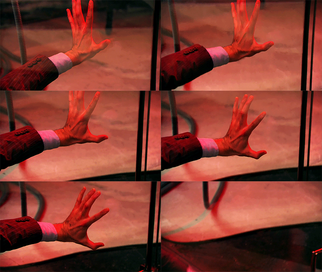
The slow way he just collapses to the ground as the pain becomes too much. The way his hand slides down the glass as he falls slowly to the ground.

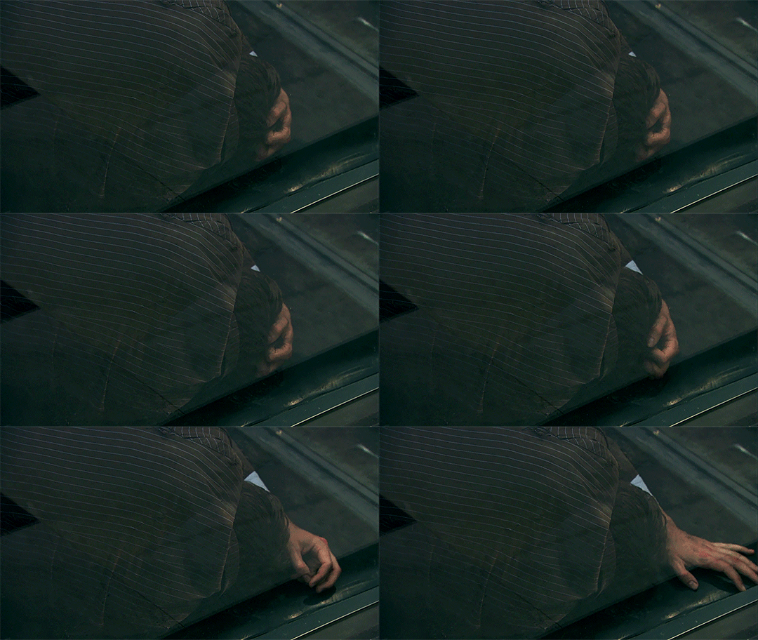
LOOK AT THIS! This is my favorite part okay? Look at how he's curled up on the ground, his hand holding his head and then he grabs at his hair in pain. And he just lays there. In pain.
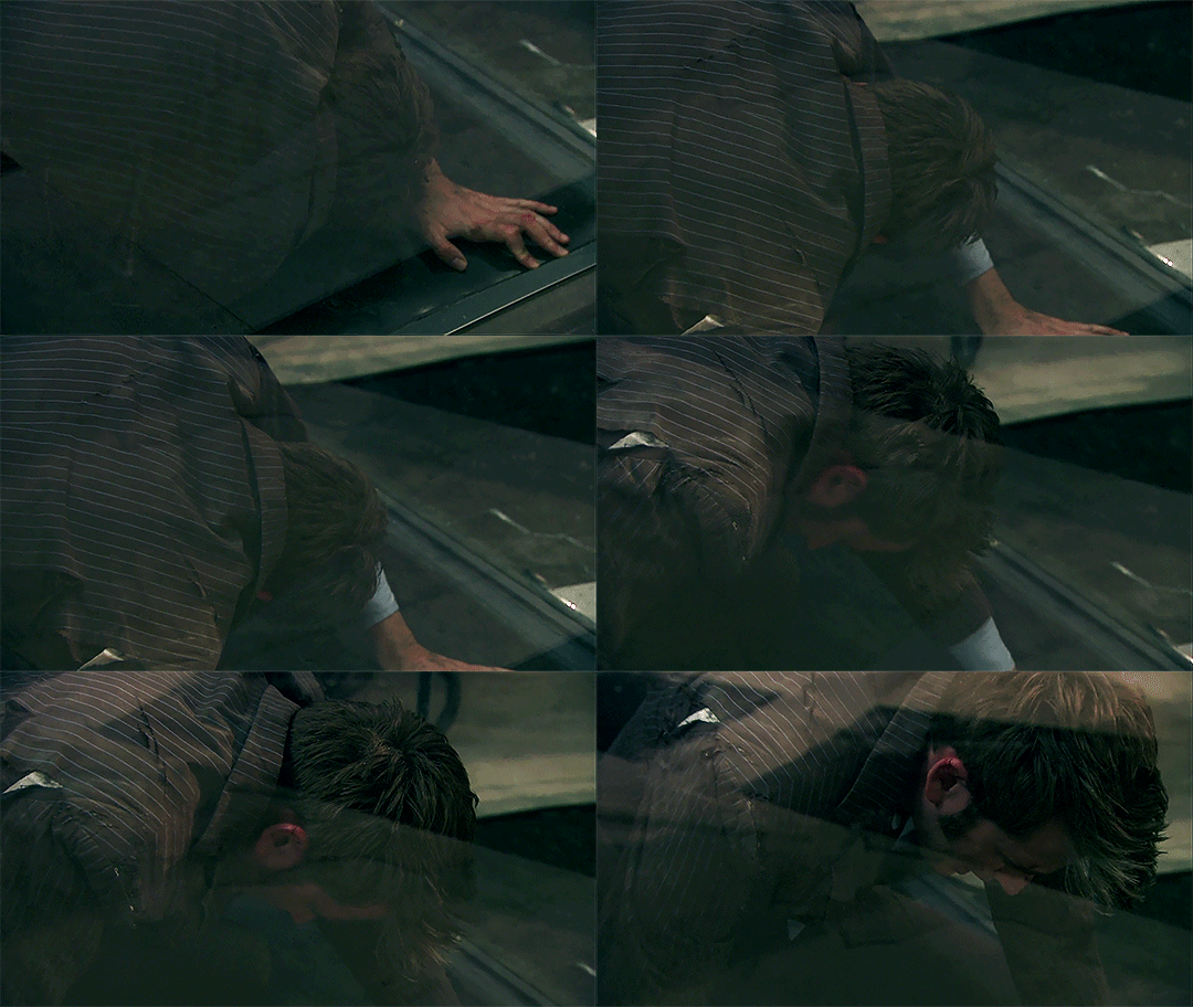
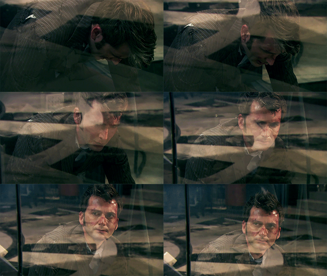
Even after the machine turns off. He's still laying on the ground in pain with his hand grabbing his hair. It takes a moment before he can let go and pull himself up.
GOD IT'S SO PAINFUL BUT SO FUCKING GOOD I LOVE IT
873 notes
·
View notes
Text
Temporary pause from working on a Charles' cricket bat gifset to talk about this shot:
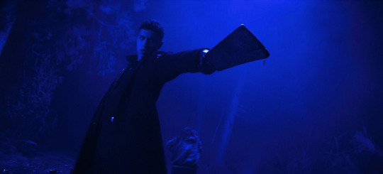
It's such a well composed shot! It's the most badass cricket bat moment and this is like the anime-styled, matrix-level, critical hit, crescendo moment for Charles after all of his anger in episodes 3-5, and now he's redirecting it in a way that is no longer terrifying to his friends but supportive (though i would argue most of his anger in eps 3-5 was still very justified).
The negative space here is just *chefs kiss* and gives space for Charles to be focused on. It's simple and uncomplicated, making it easy for us to digest just how badass Charles is.
But like, look at it overlaid with some common composition 'rules'
Rule of Thirds
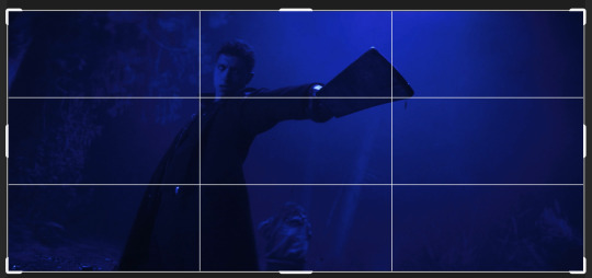
We've got him fairly well-aligned with the rule of thirds, his body and arm mostly along the lines with the cricket bat ending around that intersection
Then, similar to the rule of thirds, it fits even better with the Golden Ratio

This gets more along his center of gravity, and all that empty space on the sides just makes him even more important in the frame
These two rules, and the next one, are what makes it feel kind of "matrix"-like to me.
Golden Triangles
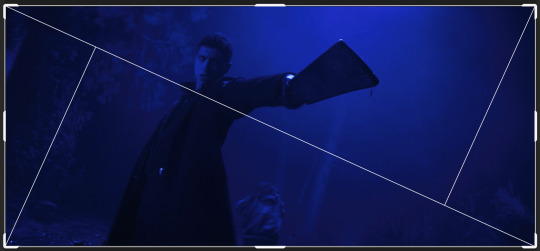
So maybe this doesn't look like it matches, and you'd be right. It doesn't match the lines of the composition exactly, but the golden triangles shows us that the shot is angled to somewhat align with this composition. Charles is parallel to those shorter lines, and the whole shot guides our eye along that long, downwards line.
If it was angled a little more or less dramatically, then it might not have had as much of an effect. This specific angle makes it feel so dynamic.
You can even use the Diagonal Composition that photoshop has (basically 2 square crosses that align with the 4 corners--with a smaller aspect ratio they'd overlap more)
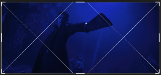
Here the thing to note is the cricket bat's edge fitting almost too perfectly with that one line.
Golden Spiral (the one where i'm definitely stretching it a bit but whatever)


So this doesn't work as much in the full frame aspect ratio (2.2:1) but if we cut out the negative space, Charles fits along the larger part of the swooping arc. Not as much of a thing to focus on at the center of the spiral, but if we flip the spiral:
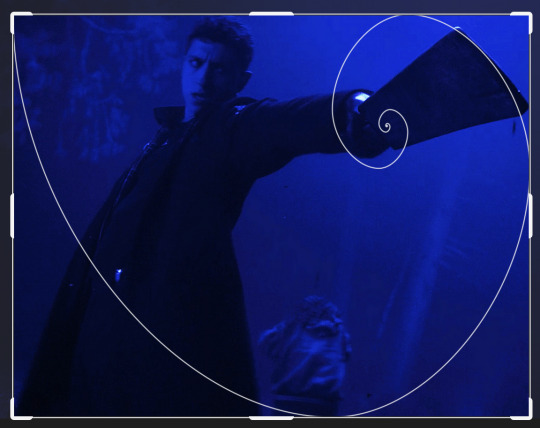
The cricket bat is in that spot. I know this is a bit of a stretch of the golden spiral, but all this to say, it's still really fucking cool.
All of these 'rules' aligning like this make it such a satisfying scene to watch. For me, when he catches that cricket bat it's like when a difficult math equation comes out to a whole number, or when a poem finds the perfect rhyme for the very last line, or when you're at the end of a whodunit and the detective lays out how the crime was committed. It's the best conclusion for an already amazing moment, everything falling perfectly into place.
#dead boy detectives#dbda#dbda meta#charles rowland#jayden revri#cinematography#dead boy detectives analysis#cinematography analysis#charles rowland cricket bat
155 notes
·
View notes
Text
Supercharged | JJK

Chapter 1: the Light Dies
masterlist | next
🗲summary: It starts with a blow to the chest that changes your life. When your city’s most celebrated hero pays a visit, it turns out the noble Bolt has no trouble tossing lives aside. Lives that won't be missed. Lives like yours. Seven mysterious and powerful men give you another chance – one that starts to feel more like a curse the moment you meet golden boy Jungkook. The boy who wants you as far from his brothers as he can get you. Is it you he hates, or the blue lightning that now runs through your veins? And could it be his golden light that illuminates your heart when darkness threatens? 🗲this chapter: He’s the hero. Unfortunately for you, you’re not the villain.
🗲pairing: jungkook x female reader 🗲word count: 6.6k 🗲genre: angst, action, eventual fluff, enemies to lovers, slow burn, superheroes/villains au, it’s sorta like a mafia au but they have superpowers lmao 🗲rating: pg15 🗲warnings: violence with superpowers, minor character death, attempted murder, injury, loss of consciousness
a/n: I have to say thank you to @casuallyimagining and @bluewhale52 for betaing this chapter, although this might come as a surprise to them since that was maybe 3 years ago now?😅I'm really not sure how much my writing had changed since then, but you guys can be the judge of that as the future chapters unfold! In the meantime, enjoy! If you want more supercharged in your life, you can also search my supercharged tag to find some musings, rambling, gifsets and visuals etc that inspired me and kept me going while I lost my mind over this story!
Lastly, I present the supercharged playlist✨ I had a lot of fun making this – several songs align with plot events, while some of them are there for the title, the vibe, or even a single line! Feel free to guess which are which or come and chat with me about it👀

An ear-splitting roar was barely contained behind shuddering steel doors. Just down the corridor, your fingers still clicked away, unperturbed, at your keyboard.
Tapping your foot, you looked impatiently up at the clock as another thunderous bellow assaulted the air. If the full-length windows weren’t reinforced by your boss, Kuyang’s own design, they would be rattling in their frames.
Blowing to rid your face of a strand of hair, you returned to your work, not even sparing a glance towards the source of the racket. It was only around half an hour until you could leave work for the weekend.
Finishing your task, you turned to filing the correspondence on your desk as a few yells carried through the air, mingled with the monster’s uproar. Bills and business deals the lot of them, you tucked them away in their respective places to be dealt with next week – only to stop on the very last one. How many times had the postman ignored the very clear sign for no newspapers?
You supposed the city felt the need to remind everyone that there was some semblance of central control – not really of much concern in a workplace such as yours, mind. Glancing across the front page, you realised why. You didn’t have a tv at home, but you would have to live under a rock not to recognise your city’s most celebrated superhero. Bolt, the media’s beloved, had claimed another victory against some crazy start-up trying to build their own bombs downtown.
The hero’s blue-masked face grinned confidently up at you from the desk, while police led what looked to be two scruffy teenagers into the back of their van. But Bolt’s vivid presence eclipsed them in his suit that matched his bright eyes.
Not bothering to read further, you pushed the paper into the waste bin at the end of the table.
Just as you were tucking away the final bits of paper, your boss emerged, wiping his brow on a cloth that looked as dirty as his face. Smiling pleasantly despite his ruffled state, you rotated on your chair to face him.
“Frank’s all good and sleepy now,” he said, “if you could get him sent up to the chamber.”
“Sure,” you nodded, already getting up and straightening your jacket.
With nothing more than a weary nod of appreciation, he left for his private laboratory. This was through a series more armoured doors, to which only you and a small number of lab workers knew the codes.
He was a scientist. And you were sure he was unhinged, but the job paid well, so that was all you concerned yourself with.
In fact, you had got very lucky. You had been surprised when such a good position had become available and quickly given to someone as ill-qualified as you, with no references to give. But your lack of connections seemed of no concern, and here you were, finally making ends meet and no longer in fear of being turned out of your run-down apartment at the edge of town.
So you did your job as well as you could, worrying yourself over nothing except pleasing the odd man that was Kuyang.
Even so, it was still a little daunting each time you had to come face-to-face with one of his experiments.
Reaching the steel doors that had not long ago been seriously threatening their hinges, you took a breath. Holding your thumb over a scanner by the door, you plastered a confident smile on your face as you walked inside.
Affectionately dubbed ‘Frank’, a great lump of teeth and dark furry flesh several times bigger than you was sleeping in a pod at the centre of the room. Surrounding this were multitudes of screens showing graphs and readings you couldn’t hope to understand.
At the edges of the room, a smattering of other workers were slumped against the stainless steel lab walls, almost as rumpled as their boss had been.
A hulking guard, Taeyeon, stood near the entrance, and you quietly confirmed with her that Frank was under and secure. Nodding, you gestured to Taeyeon’s team, another man and woman with the same uniform and intimidating stature.
Together, you assembled in front of the tank that held Frank, Taeyeon typing authorisation into one of the computers. The others locked down the external doors, just in case.
Though it was a familiar sight by now, the opening of the pod always prompted you to run through your training. If you hadn’t read it in the documents you dealt with, you would not have known Frank was also known as Necrus X, a new prototype Kuyang was working on, although you could not imagine what for.
Kuyang had been sure to tell you how to knock out the creature if it ever came to it, though. There was a spot behind his ear, which was more of a ridge at the side of his enormous head.
With the pod open, a panel rose from the floor, taking Frank rotating upwards. You caught sight of the patch behind its ear, zeroing in on it. Just in case.
The smooth expanse of ceiling split then, a hole revealing itself as the roof shrunk away into the walls, leaving a clear path for Frank to rise to the next floor, where he was stored.
As effortlessly as the ceiling retreating, a smooth steel staircase emerged from the walls. You and Taeyeon climbed it, spiralling around the edges of the circular space until you drew level with Frank, now snoring on the upper floor. Here, the space was wide open like an empty art gallery, half the walls comprised of expansive windows, no lab equipment to be seen.
The floor closed up beneath you both and you walked around Frank, opening a secret panel in the wall. As before, you raised your thumb to a blank scanner – but got no further.
A deafening smash sent you crouching to the ground in panic. Livid blue painted all the walls in the space as shattered glass skidded across the floor.
You had thought that glass to be unbreakable. At least that was the intention. But when you turned, you were forced to believe your ears: the central panel of glass was completely blown in, all the others down the row cracked from the force.
At the same moment the glass had shattered, you could suddenly hear what before had been hidden behind soundproofing. Outside, there were shouts, screams, car horns and alarms blaring from every angle – and above all, sirens. Sirens wailing through the air like disembodied banshees, descending, apparently, on your building.
Shuffling along the floor, you peered past the sleeping mass that was Frank in front of you. Walking across the room was a man in a tight blue suit, the same hue crackling in the air around his hands.
Bolt.
Mind short-circuiting, you were frozen. What should you do?
What was Bolt doing here? Was there some kind of threat? The image of him should have brought you relief, even though you knew nothing of what the danger was, but you hesitated.
Only having the presence of mind to shrink back silently behind Frank, you looked between the beast and the control panel you had abandoned. But you had no more chance to move before a fearsome crack ripped through the air, another flash of blue, sending the hairs on your arms bolting upright.
Spinning back to face Frank, you were met with a thump. A body, falling onto the floor.
Though she was mostly obscured by Frank’s sleeping form, you stared in unbelieving horror at Taeyeon where she lay, unmoving. Breath accelerating in your throat, you moved at last, scooting yourself back and away. Closer to the wall.
First you lunged to sound the alarm, mounted inside the wall panel, which instantly lit the room up in throbbing red, blaring loud enough to drown out the sirens outside. Then your hand was fumbling across the scanner. You had to get Frank locked away.
The walls of the pod which safely contained Frank overnight began to descend, much too slowly for your liking. Whirling to face the room, your heart seized in your chest when the imposing figure of Bolt, now shaded purple by the red light, met your eyes.
A glance up at the descending walls. They were halfway to the ground by now, but you still had to enter the code to lock them down.
Bolt yelled for you to stop, barely audible over the dizzying noise of the warning siren.
As he strode towards you, you could only watch, pressing yourself desperately against the wall as if it could swallow you up.
Bright light cut through the imposing red as the heavy door at the opposite end of the room was thrown open. Bolt stopped, both of you turning to see Kuyang enter. His hair was still sticking up from earlier, a strange expression on his face that you hadn’t seen before.
Paying no mind to the maniacal smile that had no place on Kuyang’s face, you took the moment of distraction to scramble for the code lock.
Without a sound, the gap between the floor and Frank’s pod closed, and your fingers were already leaping to action, typing the numbers behind your back at lightning speed.
Kuyang was running now, a direct path towards Bolt. But Bolt turned back towards you.
You were nearly done, but his hand was raising towards you…
In a split second, your fingertip met the final key of the code. Almost instantly, it was ripped away as shocking blue light cut through the air. You felt the impact before you could even notice that it was aimed at you.
Hitting you square in the chest, white hot pain scorched through your every nerve as your body was flung backwards, powerless as a ragdoll sailing through the air. The collision with the cracked window behind was almost lost on you. More intense pain was writhing its way down each limb, making you cry out, uncaring about the rain-spattered wind that whipped about your face now.
But you could see shards of glass as they fell along with you, like daggers aimed at the ground.
Biting wind rushed in your ears, the sound crashing over you like waves. And just as a pan sizzles down off the heat, the ferocious attack of pain seemed to reduce just as fast as it had invaded you.
Your heartbeat was the loudest thing, booming over the insistent web of sirens and whistling air.
Breathing choppily, you screwed your eyes nearly closed, suddenly aware of the tempest around you as you fell. Above, the already darkening winter night was illuminated with flashes of that awful blue.
You were falling.
It hit you then, as if you hadn’t been falling all this time. But it was only now that your senses caught up with themselves. You worked on a very high floor of the skyscraper, but as you were tossed around in the air, you saw the ground rapidly approaching.
A horror gripped your chest like nothing you had ever felt before.
Below you, and rushing towards you at terrifying speed, a skip sat surrounded by heaps of trash on the street. Unable to think, you could only shield your face with your hands, stretched out in front of you as if to stop the inevitable collision.
Though your eyes fell closed, you felt the jerk that flung your whole body backwards.
That wasn’t what you had expected.
Eyes snapping open in confusion, you found your vision lit with blue. In front of your face, blue light was shooting from your palms, pushing you up and away from the ground.
Your mouth fell open. Gaping in shock, you did nothing as the light died and you slowed again in the air.
Though you began falling much slower this time, you barely had time to notice your surroundings – much nearer the ground – before you were plummeting again, and this time nothing could stop you.

Your eyes weren’t even open when you felt your body slide off something. Not a second later, you were crumpling onto hard concrete which grazed your cheek.
You groaned.
It was dark. High above, any flashes of light didn’t reach you here, having landed in a thin alley beside the building. And though this shielded you from the commotion on the main streets out front, sirens still pierced the air, each one feeling like a stab to your head.
You clutched it as you maneuvered to sit. It took you a few tries, groping for a wall or something to lean against as you regained your balance.
Eyes cracking open, you waited patiently for the dark splotches to dispel before looking around.
Right next to you was a car which blocked you from view of the road beyond this alley. Evident from the dent that caved in its bonnet, that was what you had landed on.
Turning your head, you had to squint even more as light assaulted your sensitive eyes.
Among a blazing light, you could make out the vague shapes of rubbish bags and an overflowing skip that you recognised. Out of these, a vibrant fire was now burning. The correlation was too strong for you to ignore.
Breath shallow, you turned your horrified gaze to your hands.
They had done this… but how? They looked totally normal now.
Frowning, you brought them up closer to your face, so that your nose was practically buried in your palms.
No difference.
You were sure you hadn’t imagined that blue light which saved you earlier. Was there a way to make it come back?
While you were puzzling, you lowered your hands again, still staring intently as you rotated them in your lap.
Then, quick as a blink, a blue flash darted from them again. So fast, in fact, that you had no time to react before one of the bolts was fired directly into your opposite arm.
Snatching it away reflexively, you hissed in pain as a burning sensation crawled, tingling, over your skin there.
Despite the pain, the blue light didn't cease shooting from your hands. They tingled, a strangely uncomfortable sensation. It was as if something warm was wriggling its way up your veins and spilling from your fingertips.
“Stop! Stop!” you whispered in panic.
You turned them outwards, aiming away from you, but if they kept at it for much longer you were sure to draw attention.
Moving your hands around jerkily, the beams of light shook along with you, but did not go out. With each unsuccessful movement, panic made you more frantic until the glowing rays jerked erratically around the small space.
Straying too far, the light came into contact with a post at the alley’s entrance. You could only watch, helpless, as light like blue snakes skittered up it and latched around the wires it supported.
To your relief, the strange current seemed to have found an outlet, and only remained a second longer before cutting out. You were left blinking in the relative darkness. Panting heavily, you stared down at your hands, although you did not bring them too close anymore.
Once again, they appeared utterly innocent. There was nothing to suggest they had just channelled lightning through them.
Suddenly, the world plunged into darkness. The fire still burned at the other end of the alley, or you would have been left totally blind. In the building behind you, in the street, all the lights had gone out.
Almost instantly following the blackout, screaming rose again in the air.
Gulping, your eyes travelled to the blackened post at the corner, which you had accidentally electrocuted.
This was bad. Your head was spinning, both from your short, hard fall and from the whirlwind of events that had happened in what could only have been minutes. Surrounded by darkness, with the wail of the city and a fire for company, you could only see one course of action.
Run.
You had to get away from here. It wasn’t safe. You had little idea where was safe, but you couldn’t be here anymore.
It wasn’t like you had anyone to call who would care enough to come and pick you up. Nor did you have the money to try a hospital, though you felt as if you may need it.
But especially with electricity shooting from your hands at the drop of a hat, it probably wasn’t best to be anywhere around people.
The dizziness from your unfortunate landing on the car had worn off while you were sitting, but the world swayed anew the moment you made to stand. Pushing determinedly against the wall, you struggled on anyway, brand new dark spots in your vision offset by the brightness of the fire you walked towards.
This end of the alleyway led out through smaller streets, away from the city centre and furore of sirens.
On reaching the opening, you cautiously assessed the road stretching away either side. Empty. And if there was anyone there, they wouldn’t see you in this darkness.
Shoving your hands beneath your armpits on some misguided hope of keeping them from causing problems, you lowered your head and ran. It was more of a jog, considering everything, but you still moved as quickly as you could beneath the dead streetlamps.
Head throbbing more with movement, you stumbled a few times as you went. The pavement tilted around you.
You had made it a few roads before you felt that awful tingling in your arms again. It itched, like something fighting its way out of your skin.
Nausea rolled in the pit of your stomach. This couldn’t be real.
Slowing down and stopping beneath a signpost, you drew your shaking hands out in front of you. The world careened on its axis, revolving around the sight of your palms as a faint blue glow grew in them.
You were going to throw up, you were sure of it.
You wanted it to stop.
A few flickers of blue darted down the veins in your wrist. Towards your fingertips. Sparks leapt from them, small tendrils of lightning crackling between your fingers like webbing.
At last, you gave in to the rising horror mixed with a sick feeling. The floor’s spinning became too much, your hands turning to a bright blur in the centre of your vision.
You passed out on the spot.

Lights were turning on again around the city. Television sets flickering back to life to announce Bolt’s victory against the beast that had attacked earlier that evening.
But not on the street where you still lay.
The return of light only reached neighbouring roads, dim glow snuffed out before it could penetrate the middle of this street. A white-haired young man stepped forwards, but his face was totally obscured in darkness.
“Here,” he spoke to the silence.
The next moment, a deep red glowed in the middle of the road, though it brought little light. The red bounced off a signpost before it was gone, replaced by another man, seemingly from nowhere.
The newest arrival stood there, looking down at your figure, unconscious by the sign. Then he disappeared again, leaving total darkness behind as if he had never been there at all.
A few more moments passed, you and the hidden man the only beings on the dark road.
Not very long after, a car’s engine rumbled and sputtered into earshot. The bright beam of headlights rounded the corner, growing larger and shedding light on your form as it drew closer.
Pulling up next to you, the engine died along with the lights. Two doors opened and slammed shut.
As two pairs of feet stepped nearer to join the one remaining beside you, the streetlamp directly overhead began to glow. The faint glimmer grew until it illuminated the scene. Still no other lights joined it, leaving the small group of you lit up as if by spotlight.
“It’s her?”
The man crouching beside you asked the question without looking up, and the shadowed man answered.
“Pretty sure.”
“She’s breathing?”
“Yes.”
The crouching man hummed. Moving to kneel instead, his eyes roved over your somewhat battered face, dark hair obscuring his own.
“Namjoon?” he asked then, turning to the other man from the car. It was the same man who had momentarily appeared in the street earlier.
Taking his cue, the tall man, Namjoon, walked forwards and bent to lift your hands by the wrists. In just moments he was placing them carefully back, nodding.
“No doubt.”
“Okay then.”
“Can she travel, Jin?”
“Give me a moment.”
Producing a small object, he pressed a button and a small light sprung from the end. Carefully lifting one of your eyelids, he shone the light into it, observing like a doctor.
The first you became aware of was the far away sound of voices being quietly exchanged. But with the cloudiness in your head, identifying them didn’t seem very urgent. You were preoccupied with the swirling feeling that made the world swim around you, even though it was dark.
But as dim awareness was returning to you, the process of regaining your senses was violently accelerated as a blinding light was thrust into your vision.
You flinched, and as Jin pulled away he saw you blink, eyelids screwing shut in protest. His eyebrows raised in slight concern as he watched your first groggy movements.
Blinking around at the dimly lit figures over you, your eyes widened. The nearest man held the illuminated light stick. Was he a doctor?
Next, your eyes darted to the tall man standing behind him. You recognised neither.
Some strange feeling told you someone else was standing there too, but when you looked to your other side you were faced with nothing but empty shadow.
“Can you sit?”
The first man’s question was gentle, his hands ready to support you.
Nodding timidly, you heaved yourself up with his help. It embarrassed you to be panting after just that much movement.
“What happened?” came the next question.
As you replayed the events, you avoided their eyes. You could not let them know what happened, what you had become. They were helping you, and yet you might hurt them-
Fists clenching subconsciously, you stuttered in panic.
“I-I can’t pay,” you told them, but before you could say more a new voice was speaking. The standing man stepped forwards, his voice calm and surprisingly friendly.
“There’s no need to pay. We can help you. Can you tell us what happened?”
“I don’t, uh, I-I-“
His eyes travelled towards your hands, which you were trying to tuck behind you.
“You gained powers, didn’t you?”
You froze.
“I have them too,” he smiled, “I know what it’s like to be scared. But you can work with this and learn to control them. I’m Namjoon, and this is Jin. We’ve been through this before, we can help you.”
At your sides, your hands relaxed. Tension lifted from your tightly hunched shoulders. Wordless, you looked between the men who were watching you, ready to move, but only on your word.
Swallowing, a light frown creased your brow.
“What do you want-”
Namjoon’s smile dimmed into something kinder.
“At least let us check you over.”
Your hands fretted together. It was strange, you couldn’t feel anything there. Surely they should feel different? How would you know if these… powers, Namjoon had said, were to come back?
“You won’t hurt us, don’t worry,” he seemed to anticipate your thoughts as he watched you, “we can protect ourselves.”
“You were unconscious,” Jin spoke, drawing your perplexed gaze back to him, “did you hit your head?”
You blinked, but found yourself answering.
“I think so.”
Nodding, Jin shuffled at your side. He leaned a bit closer.
“I need to shine this light in your eyes again. You may have a concussion.”
Complying, you sat through the eye-watering brightness. He asked you things, like a doctor would, except he was working in the middle of an empty street in the middle of the night.
“Do you feel dizzy?”
“I did. I think still, a little.”
“Any nausea?”
“Yeah… but maybe because of the…” you gestured to your hands.
Jin sat back, taking the light with him. Namjoon shot you a sympathetic smile at that. You supposed he had been through the same thing, from the sounds of it.
Jin looked up at Namjoon.
“It looks pretty rough. Definitely a concussion, and she needs patching up, but in the long run she’ll be fine.”
“I-I’m serious,” you interjected, “I don’t have the money for hospital…”
Your voice faltered. You half thought of asking to just go home, but you were hardly sure of even making it there by yourself. And if you got there, then what? The prospect of burning down the place with these errant powers didn’t fill you with comfort.
“Good thing we’re not going to bring you there, then,” Namjoon said, “but I meant it when I said we could help. We can take you home, if you want… but you can stay with us, too.”
You stared at him wordlessly. Was it crazy that you were considering this?
“Just for a bit, if you need,” Jin added softly, “it’s just… now might not be the smartest time to be alone.”
You chewed your cheek. But your head was pounding too much to think very hard, and this seemed like the most straightforward option. The people in this city kept surprising you, after your first stroke of luck with Kuyang's generosity.
“Sure…” you spoke quietly, not quite able to look them in the eyes, “yes please.”
“Okay,” Namjoon took it in stride, “but let’s get moving.”
“Just one moment – we should wrap that.”
Gesturing towards your arm, Jin stood and went back to the car. On his return, he knelt again and began to secure cling film around the angry red blotch blistering your skin, where you had caught yourself with your own beam.
“We’ll sort it out properly when we get back,” he told you, “but Namjoon’s right, we should be going.”
You followed his gaze which seemed to dart up and down the street. However, nothing was there.
Jin helped you stand, still looking around. Sure enough, the dizziness from before hadn’t quite left you yet. Biting down on your lip, you focussed hard on getting the short distance to the car. You were led to the passenger seat and crumpled gratefully into it.
But just as Jin closed the door, you felt an uncomfortable prickling clutch your forearms again. Namjoon slid into the back seat in time to hear your gasp, noticing the way your fingers flexed in panic. Digging in his pockets, he produced a pair of thin black gloves and held them out to you just as the first trickles of blue appeared in your veins again. He watched with a studious frown as you pushed your hands into the gloves.
“Those will help,” he said, still looking at your wrists, “they can contain the powers. But you shouldn’t keep them on for too long.”
Jin was seating himself in the driver’s side as you frowned over at Namjoon. At first you had been relieved to have a solution to your erratic lightning problem, but that was ripped away at his last addition.
“Why not? It will keep you safe,” you questioned, but kept your voice quiet.
“Don’t worry, we’re more than capable of handling anything you could throw at us,” he laughed, “but you can keep them on in here. Best not to bottle up your powers forever, though.”
Resigned, you turned back to face front. The moment Jin stepped on the gas, all the lights in the road sparked to life at once. Startled, you blinked, looking around. On the pavement you were just pulling away from, a man was walking away, unidentifiable behind a hoodie.
Slumping back in your seat, you breathed a short, dry laugh. This mysterious happening was just the latest in this crazy night. You had no choice but to accept it.
The car ride was fairly short, but you were too tired and distracted to take in exactly where you were going. Streets seemed to blur together, aware only that you were heading out of town.
The itching in your arms had persisted for a while, but as promised, the gloves seemed to work. No fiery blue burst out of your palms, and, eventually, whatever it was decided to give it up, subsiding again by the time the car pulled up.
But no one got out yet. Jin had stopped at the end of a small road, big enough for only one vehicle, directly facing an expanse of crumbling and graffitied brick.
Curiosity woke you up from your daze, and you watched as Jin reached to tap something on his dashboard. Almost instantly, a groaning reached your ears from over the whirring of the engine. The wall ahead shook before shifting, sliding sideways until it tucked itself behind a dented dustbin, unveiling a space beyond.
Leaving you little more time to wonder, Jin started the car again and you rolled downwards through a plain, dark entrance. It reminded you of those multi-storey car parks formed with ugly blocks of concrete. It was considerably smaller than those, however, Jin pullingup into a space alongside about a dozen other vehicles, beyond which the place seemed entirely deserted.
Jin came around to open your door, but you were able to stand by yourself. It was still a bit of a struggle, your limbs sluggish and the world dull around you – although that may have just been the low underground light.
Namjoon led you, Jin staying close by your side. Blinking at the space as you moved through it, your eyes traced over the various car roofs, some cleaner than others. A larger four-by-four was particularly beaten up, with a large crease in one of the metal wheel arches.
Your eyes rested longest on what was probably the most pristine: a motorbike, at first hidden by the cars either side of it.
Soon enough, you were past them. Stopping as Namjoon did, you watched him expectantly. However, he did not turn around, instead standing face-to-face with a plain concrete wall. Except… now a low rumble announced the movement of a panel which slid away, revealing a wide doorway which had previously blended seamlessly with the flat wall.
Your eyebrows raised at the touch that was reminiscent of Kuyang’s lab. Without time for you to dwell on this, your small group moved up a dingy staircase that lay beyond the doorway.
At the top, you emerged into a new space, notably lighter than before. You assumed you were back on ground level, perhaps above. It was hard to be sure, disoriented as you still were in the whirlwind that had overtaken your day.
Bizarrely, the space appeared to be someone’s home. There was a large and coffee-stained table surrounded by mismatching chairs, a kitchen behind it littered with mugs and pot plants. Still, beyond the lived-in array of things lying around, it was big. You imagined it must be miles more expensive than the shoddy apartment you stayed in.
It was open plan, and you followed Namjoon past the dining table towards an area filled with two enormous sofas.
The back of a blond head was visible over the sofa, and now the person turned towards you.
“Guys!” a loud exclamation rang out as he leapt up. A dazzling smile spread across his mouth.
When his eyes fell on you, wincing at his sudden volume, the smile dimmed a little.
“Not so loud, Hope-ah,” Jin spoke gently from behind you.
“Sorry,” he dipped his head, smile remaining on his lips.
Jin’s hands came lightly to your back, steering you over to a sofa. As you sunk into it with relief, the blond man sat across from you, tilting his head to catch your eye.
“I’m Hope,” he smiled, “I’m glad we found you. You’ll be right in no time!”
Frowning, you couldn’t help but notice his eyes flicking over the damage on your face. Averting your gaze, you chewed your lip absently.
What did he mean? I’m glad we found you…
Had they been looking for you? You still weren’t sure if it was a lucky coincidence they found you, but perhaps it was something more.
The lingering ache in your head forced you to push the issue away. You missed Namjoon’s stern look at Hoseok as he hovered behind your seat.
Jin pulled a pack from a cupboard and set it beside you. You let him lift your arm and unwrap the burn, your unfocussed eyes dragging across the room while he applied something cold over it. Next came stinging, scattered over your face as he wiped at the small cuts and grazes with an apologetic grimace you barely saw.
You only forced the world back into focus when someone else entered your sight. Emerging from behind you, a gentle, friendly smile was directed your way from a man with pale pink hair. Swallowing, you never managed to smile back before he was turning away.
The pink-haired man reached a hand out to someone you couldn’t see. Another man appeared, walking towards him, but he never looked at you. Or if he did, it was obscured behind the black hair that fell to his eyes.
The two new people left towards the kitchen, though not without another smile from the pink one.
Who were all these people?
Frowning after them, you were interrupted by a clap on the shoulder from Jin.
“We’ll talk more in the morning. You need to rest.”
Looking around, you had half a mind to protest, but were overruled by the shakiness taking over your frame. Body too fatigued to allow you much say, you meekly followed Jin.
Beyond the living space, a thinner corridor led away, several closed doors along its walls.
Further you went, until a door just ahead opened. Another person walked out.
When he stopped to face you, his posture remained stiff. Tall and muscular, he was clad all in black except for a towel slung over his shoulder. Damp hair fell messily around his head. But you had little time to take this in, as his eyes fixed themselves fiercely on yours, rendering you unable to look away.
Mouth remaining in a hard line, his expression only twitched further into a frown.
Then his gaze flicked abruptly away, travelling to Jin just beyond you.
“Kook-“
Jin never got further than that before the man strode forwards, marching sharply past you and away with a scowl. Turning after him in surprise, you watched his tense shoulders disappear behind Namjoon, who you hadn’t noticed hovering.
Namjoon stared sternly after him, but the man seemed to avoid his gaze.
Jin sighed, sending an apologetic glance at you.
“That’s just Jungkook,” Namjoon spoke, ushering you all further along the hallway, “don’t pay him any attention.”
“Why was…”
You trailed off, unsure of what exactly to ask. Neither of them made an attempt to answer.
You had no idea a wordless encounter could leech so much hostility into the atmosphere. Picturing Jungkook’s glowering face, you blindly followed the others through a different door.
“You can sleep in here.”
“Hm?”
Shaking yourself, you looked around the new room. There wasn’t much to see. Beside a low bed, there was a mirror, a wooden closet and nothing more. Looking up, you didn’t even find a light in the ceiling. The only light leaked through from the hallway.
Clearly reading your gaping mouth and furrowing brow, Namjoon moved in front of you.
“Don’t worry, this is just a place to sleep, nothing more. But since you’re going to have to take those gloves off, we can’t have you in a space with any electricals.”
Stepping back defensively, your fingers pressed tightly together. Having the gloves on had let you almost imagine that nothing life-changing had happened. Like gaining unpredictable powers, for instance.
Namjoon watched patiently, holding out a hand.
“You don’t need them…”
He realised he had never asked your name, and let his sentence trail expectantly. Telling him your name, he relaxed into a smile.
“You don’t need them, Y/N,” he repeated, not that you believed him for a second, “you’ll be perfectly safe. And so will we.”
Only the yearning to collapse onto the bed persuaded you to hand over the gloves. The instant they were in his hand, you swore you could feel a shock go up your arm. Immediately tense again, your breathing became shallower, with no idea how to try and stop power shooting from your hands any moment.
But Namjoon and Jin seemed content. Before you could gather your thoughts, they had left, closing the door and drenching your room in near total darkness.
Stumbling to the bed and virtually falling into it, you wiped sweating palms against the fabric. Your mouth was dry with fear.
This couldn’t have happened.
Alone for the first time since your initial panic, it didn’t take long for your mind to wrap itself in circles again. Only hours ago, you had been sitting happily in your bright office, going through the motions…
One split-second decision from a powerful man had changed that.
You knew full well he had intended for you to die. But he was Bolt...
He had probably forgotten about it already. The guard he sent lifeless to the floor, the secretary he threw from the building.
Itching feeling returning, you swallowed desperately and raised your hands. Sure enough, against the darkness, blue pierced your vision, darting its way up-
Turning your face away, you flinched as the outburst came. Your eyes screwed shut, you pressed your cheek into fabric, not wanting to see the deathly lightning that shot through the room. Shuddering breaths broke into your lungs when at last it subsided.
Letting them fall, limp, to your sides, your hands fisted the covers tightly.
You were almost afraid to open your eyes, knowing it would only show you the empty room, confirmation that this was real. You were dangerous, shut in a safe room where you could hurt no one. Would you ever get out? Succeed in controlling this, like Namjoon had said?
With no idea where you were, barely any idea who the people here were, you wanted to block it out. But even with your eyes closed, you couldn’t escape.
The memory of Jungkook’s suspicious face made your heart sink. Perhaps people should be afraid of you, now. As much as you may want to, there was no getting away from this.
Pushing yourself to sit, you surveyed the room. Eyes accustomed to the blackness a little more, you could make out vague shapes. Your breath fell alone in the silence. This really was the safest place you could be right now, even if it was a nightmare.
As your head turned, you suddenly came level with your eyes in the mirror, and a shock of light.
For an extended moment, you could only stare.
Then all at once you were rushing forwards, tripping from the end of the bed. Bracing your arms against the wall either side of the mirror, you gaped at your reflection.
As you watched, an angular bolt of blue shot across your irises, which were already dimly glowing.
You gulped against the thick feeling crawling up your throat. Faced with this, you could no longer have any hope of denying it.
This was really happening.

Thank you for reading!! Please please let me know your thoughts on this chapter, comments make it all worthwhile!💜💜
masterlist | next>
taglist: @aianloveseven @preciouschimine @written-in-flowers @taegularities @dvalities @parapiop7 @taiwan0618 @11thenightwemet11 @junniesoleilkth @doctorquack @oddinary4bts @svnbangtansworld @ktownshizzle @minisugakoobies @jksusawife
Let me know in a comment or ask if you would like to join the taglist🥰
#bangtanarmynet#jungkook x reader#jungkook imagine#jungkook fanfic#jungkook x you#jungkook angst#jungkook au#jungkook mafia#jungkook scenario#bts mafia au#jungkook supervillain#jeon jungkook fanfic#bts jungkook imagine#jeongguk x reader#bts series#jungkook series#superhero bts#supervillain bts
347 notes
·
View notes
Text
UraIchi Week 2024
Monday, July 1st, 2024 - Sunday, July 7th, 2024
AO3 Collection
Full Prompts List Submitted This Year
(Click images to enlarge. Alt text under the cut.)
What is UraIchi Week?
It’s a week-long fanworks event to promote the Urahara Kisuke x Kurosaki Ichigo ship. There’s no sign-up, it’s just for fun, and everybody can participate. Completed works and wips are both acceptable, and any type of fanwork (fanfic, fanart, gifsets, etc.) is welcome. NSFW and/or potentially trigger-y content is allowed, although please remember to tag your works properly.
The ship itself can be written romantically or platonically, as lovers or friends or even enemies, so long as it stars these two characters together in some way. Poly ships are also fine so long as Ichigo and Kisuke are still the focus of the fanwork. And crossovers and fusions are also allowed even if it isn’t one of the given prompts for the event. Basically, anything goes, and the only criteria is that it has to be UraIchi-centric.
Posting:
UraIchi Week is hosted here on Tumblr and on AO3. For posts on Tumblr, remember to ping @uraichievents and tag #UraIchi Week 2024. For AO3, you can add your work(s) to the collection linked up above. You are also welcome to join the UraIchi Discord server if you haven’t already and come and talk about what you’re working on!
Themes:
July 1st, Day 1: i've met you before / i'll meet you again / this is the first time we've met.. right?
Time Travel / Dimension Travel
Identity Porn / Hidden Identities
“I've suffered from traumatic dreams of my past lives since I was a child, and I'm just now realizing that coming up to a beautiful stranger who looks like someone I've seen die a thousand times in a thousand different ways at a bar and asking if we've met before sounds a lot like a come-on haha no wait come back that doesn't mean I'm not desperately attracted to you please kiss me again” AU
July 2nd, Day 2: It's fact that killable problems are not real problems.
Murder Husbands
Ichigo is Deadpool / unbreakable / any other accidentally immortal being who is really kind of annoyed about it (because it’s boring, and he’s still young enough to be within his lifespan, but it sure takes the fun out of fighting).
All the times Ichigo died, he ACTUALLY died, he just came back. Every time he comes back, he comes back Wronger.
July 3rd, Day 3: Things I Should've Told You / Things I Don't Tell Anyone Else
The skeletons in your closet are about to overflow. Would you like me to tidy it up?
Ichigo is experimenting with self-expression, a hobby, etc., making up for lost time as a regular teenager. Urahara is always the first one (sometimes only one) to see or hear about a new idea.
“The person I trust most is you.”
July 4th, Day 4: Sword and Shield
I am yours to command, use me as you please.
Shiba!Ichigo and Second Division!Kisuke
Summoner/Mage AU: Paired summons who are good apart but unmatched together.
July 5th, Day 5: That One is Mine
Hollow Instincts / Feral Protective
Possessive!Kisuke: He stepped aside for Sui-Feng because Yoruichi was always master first and friend second and love interest never, and because Yoruichi wanted her in a way she's never wanted him. But Ichigo is different, and everyone soon realizes that when Kisuke truly wants something, he always gets it in the end.
“Death can’t have you. You’re mine.”
July 6th, Day 6: Monsters come in all shapes and sizes. Some are born, some are made, and some decide being a monster's pretty fucking cool.
Visored!Urahara Kisuke AU / Vasto Lorde!Kurosaki Ichigo AU
“Ichigo forges a friendship with his Hollow in the Shattered Shaft” AU
vs. Gotei 13 AU: Ichigo time travels back from a future where he was chained to the throne as the next Soul King by the Shinigami.
July 7th, Day 7: Creator’s Choice!
As always, the above prompts are all optional, and you’re free to come with your own ideas. You can also find an excel sheet with all the prompts submitted this year linked up above, so feel free to look through that if you want, and you can also make a copy for yourself.
And that’s it! We’re looking forward to what everyone comes up with!
182 notes
·
View notes
Text
im gonna break down my last gifset: the second half of the ep12 intimacy scene, because nat and louis are such good actors ive been rendered slightly braindead more than once due to how well they SOLD this scene and SOLD ai di and chen yi's love for each other through their physicality.
WARNING: if you read this and then use the words top or bottom to describe anything going on here, i will deadass block you. ♥️ don't even think about it. ♥️
this is gonna be unhinged but the mix of horny and pure adoring each other is an ever-crisscrossing line that is simply underappreciated from what ive seen in previous posts of this particular part.
so they've been making out for a while with ai di in chen yi's lap and chen yi decides to push them over… i did not cut a single frame of this btw.
starting with the first two gifs:


i love the way ai di's hand comes to rest perfectly at the nape of chen yi's neck during the impact. then there's a brief "are we gonna kiss?" half of a second before chen yi goes for ai di's neck. and ai di responds appreciatively: with his head tilted back, his hand in chen yi's hair… you see in the second gif his fingers curling a little, to gently trail his nails down chen yi's neck, wordlessly telling chen yi to keep going. and he does, moving from ai di's neck to his chest.
and here we get a moment of ai di going oh. his mouth literally opens a little wider—

—and he lifts up his head as if to check that that's really chen yi doing this to him. all the while his hand has moved from chen yi's neck/hair to rubbing chen yi's shoulder. again in a reassuring "yes that's good" way, and also, i imagine, just for the sake of touching chen yi too.

he looks at chen yi and then full body relaxes into feeling it, while still rubbing chen yi's shoulder. i cant get over ai di's face here, i can't. the whole shot is art, with chen yi kissing just below his ribs.
bc chen yi is so focused on adoring him, on pouring all this love he has for ai di into these gentle kisses and the way he's touching him, too: sliding his hand up ai di's chest to grip his shoulder in return. (also notice ai di's sweatshirt from four years ago hanging up in the background. chen yi has been waiting so long for this too and needs to show it.)
and then— WELL. then ai di slides his hand back up into chen yi's hair…

and chen yi responds to the feeling of it immediately. it's almost like ai di is saying yes, that's good, now come here, and you see chen yi's eyes open and his body immediately follow that cue. perfect wordless communication. ai di's hand is literally pulling him closer (with barely any pressure) and chen yi instinctively responds to it by making his way back up with another soft kiss.
and ai di is watching him, waiting for him. chen yi's hand is sliding along ai di's chest again… you even see ai di's legs open a little at the end of the gif to make room for chen yi to take that space again.
and chen yi does. he really does:

and he does that on purpose. (it's like he's responding to ai di's satisfaction by saying, "let me make it feel even better". while also saying "i love you this much".)
and ai di responds by intentionally adjusting himself to feel more of it:

chen yi moves back from the neck kiss and ai di really said with his body: no, don't you dare take that pressure away.
there is so much going on in those two gifs. starting with the former: you can see ai di leaning back for the neck kiss, and then his hand moves down to chen yi's hip the instant he feels the pressure between his legs, in such a perfectly instinctive movement you can literally see his fingers tighten in chen yi's hair and his toes curl at the edge of the gif. he is completely 100% feeling it. he lifts his head to look.
—& i can't get over the way ai di is always trying to see, to watch chen yi doing this to him. it's chen yi. he has to make sure it's real. he has waited for and wanted this for so long and he isnt dreaming anymore.
and then in the latter: ai di tilts his head back again a little before his shift. his very intentional shifting of hips that physically lifts his back from the bed a little to align them more comfortably and to keep the friction. this movement stops chen yi from kissing ai di's neck again, bringing him to his mouth instead— but not until after ai di's hand on the back of chen yi's neck slides down to cup his cheek. (as if this whole gif says, not only "yes, that feels good, don't stop", but also, "i need you to know i love you".)
they kiss like that: pressed together, looking at each other, ai di cradling chen yi's face with one of his hands. you can see his thumb holding the base of chen yi's jaw in the next gif:


while chen yi in turn pulls his arm out from underneath ai di to prop (only) his chest up a bit higher for the express purpose of just looking at ai di. feeling ai di touching him like this, too. both of them gentle and needy, adoring and eager; all of that fully communicated through their body language.
there is not an inch of them that isnt feeling this moment and isnt completely tuned in to both themselves and the other. it's so intimate and vulnerable and so intentional. and the fact that they are taking their time, always looking at each other, is what makes it so loving and sweet and is also exactly what makes it so hot.

it's chen yi's turn now to check that this is real. to soak this all in and breathe. that's ai di beneath him. against him. loving him.
and it takes a full gif but ai di allows maybe 2 seconds more of looking at each other before reaching up and pulling chen yi into a deeper kiss. he's waited for this for so long—

although first you see ai di's eyes flick down and back up. and let me tell you— he's not looking at chen yi's lips.


chen yi's hand perfectly supports the back of ai di's head and neck as ai di surges up to wrap chen yi in his arms—cup the nape of chen yi's neck in his fingers—pulling himself up and chen yi closer in the same movement.
and this is when and why the camera pans away. because those kisses are getting deeper. they are locked in, they're attached, they are feeling all of it, everything is intentional and loving and very clear about where this scene will be going next.
i just— this is a lot, for me. because it is so intensely loving. and also so intensely horny. like, i've seen some good sex scenes, but it takes some really incredible acting to pull off seeming so fully, devotedly, in love, and be able to show that alongside and through attraction. personally? i haven't seen any bl actors do it better than nat and louis in this scene right here. please notice, as well, that all thirteen of these gifs are of one, continuous, shot.
simply put, it's a very. very. well done scene. AND I NEED TO CHEW DRYWALL.
(final note: a reminder of my warning at the start of this post bc i am serious. there are too many infinitesimal things happening in this scene for these characters to be reduced to stereotypes that, frankly, do not matter in real life. ♥️ no need to respond to this warning either… feel free to focus on what the post is saying instead.)
and that's why chen yi and ai di are better and more real than every other bl couple in existence. ok bye.
#kiseki: dear to me#kdtm#kiseki dear to me#julian watches kiseki#ai di x chen yi#chen yi x ai di#louis chiang#chiang tien#jiang dian#nat chen#chen bowen#*mypost#long post#pdribs#only tagging you lin bc im linking this in the original gifset but i know you love analysis so hiiiii 🥰🥰🥰#thank you to the 9 people who voted in my poll telling me to post this#i was going to anyway but i love to see more people on board for this shit#& like. okay i may SEEM composed in this post but PUHLEASE know that i spent the whole time giffing this last night losing my fucking mind#and getting very very distracted. and reminding myself to breathe#because#WHHEWWWWWJFKSDJFLKSHLGDSAJSDFJ#dear god is this ALLOWED?????? IS THIS ALLOWED?#EVIDENTLY YES!#and THANK god. thank fucking god
104 notes
·
View notes
Text

i told my friend i would find him some beginner’s giffing tutorials, but all the one’s i could find were either years out of date, used a method that made me go “huh”, or incorporated ready-made actions. all perfectly fine, but if i’m sending someone a tutorial i’d rather it be one for a method i understand enough to help with.
so, here is a beginner’s guide to giffing, as told by cleo, a neurotic, detailed, and organization happy individual. there will be many pictures.
this tutorial will strictly cover the gif making portion of the process, from getting your screencaps to importing in photoshop, resizing/cropping, and sharpening. i was going to briefly go over colouring, but tumblr only allows 30 images and i ran out of space, so i'll have to do a separate colouring tutorial (which also means i can go into more detail, yay).
downloading the videos, whether direct downloads or t*rrents, is also another tutorial. but make sure you’re using at least 1080p, and the bigger the file the better. a single episode of a ~45 minute show should ideally be 2gb at minimum. a full length movie should ideally be at least 5gb. imo 2160p/4k files are not really necessary; the quality increase is negligible, and it takes a lot longer to screencap them. if you do use 2160p/4k files, try and make sure it is not HDR, as those videos are often washed out and require a different screencapping program to fix.
Programs
I am using a cracked version photoshop 2022, but whichever version you use should be pretty much the same
Actions. not a program but a function inside photoshop, where you essentially record a series of steps, and then you can simple play that action when needed and those steps will repeat, which saves considerable time when giffing. I will note which parts of the tutorial are best saved as actions, and explain how to create actions at the end.
For screencapping i use kmplayer it’s free and very simple to use
not at all a necessary program, but i use freecommander instead of the regular windows file explorer as i find the dual panels very helpful when moving the frames around
Screencapping
there are many programs you can use to get the screencaps from a video, a lot are basically the same, some are better suited for particular video file types. kmplayer is a very simple program to use, but afaik the capture function only works on mkv. files (the only other file type i’ve tried is mp4, which plays but does not capture)
once you open your video file in kmplayer, we’re going to open the advanced capture window, found under capture→advanced capture, or alt+v
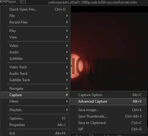
the window should look like this
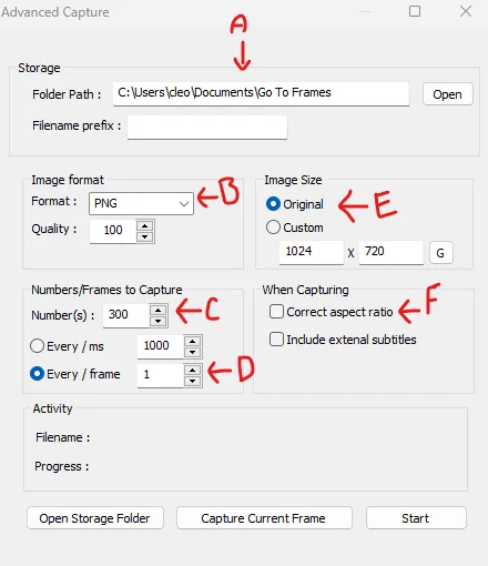
A-this is where all your screencaps will save to. i recommend making a specific folder for all your screencaps
B-make sure this is set to png for best quality
C-this is the number of screencaps you want to take, guesstimate how many you will need, keeping in mind that most videos are approx. 25 frames per second, and you should always cap a bit more than you think just in case
D-make sure “every/frame” is selected and set to 1
E-make sure “original” is selected, resizing will be done in photoshop
F-make sure “correct aspect ratio” is unselected
go to the part of the video you want to gif, and pause it just slightly before that part starts, then select ‘start’. the screencaps will start to save to the file, no need to play the video, and will automatically stop once it has capped the number of frames you have chosen
and here is how they look inside freecommander. i have already made a folder for this gifset, which is on the left. now you’re going to make a folder for each individual gif. i’ve decided this one will have four gifs, so create four folders (i just label them gif 01, gif 02, etc) and then move the frames for each gif into their respective folder
while you can always delete frames once the gif is made if it’s too big, i prefer to make sure i have the correct number of frames before i start. the gif limit on tumblr is 10mb, so it’s good to look at the scene/shots you’re giffing and decide approx. what dimensions your gif will be. full size gifs have a width of 540px and your choice of height. if you go for a square gif (540x540) you can usually fit 40-50 frames. if you’re planning for a smaller height (such as 540x400) you can usually fit more around 50-60 frames.
and here are the caps inside the folders. another reason i like freecommander is it’s ability to “multi-rename” files. the default file explorer can do so as well, but you have to do each folder individually and you can’t customize the new names as much. either way, i prefer to rename the files to each gif just to scratch my organization itch.
Introduction to Photoshop
NOTE: i have changed many of my keyboard shortcuts in photoshop to ones i prefer, so any you see listed in the menus of these screenshots are likely not the original shortcuts. you can see and change them yourself under edit→keyboard shortcuts

quick run-down of the photoshop interface. i have adjusted placement of some things from the default so this isn’t exactly how your photoshop will look when you open it, but everything is labelled, either on top or by hovering over the element. once you’re more familiar and have your process down i would recommend adjusting the workspace to suit your process.
A-your main tools and colour selector. almost all the tools have either several tools in one, or have alternate options which can be accessed by right-clicking the tool. you can also hover over each tool to get a pop-up with a quick explanation of the tool
B-additional “windows” such as history, properties, actions etc. can be opened from the window menu at the top and moved around with click-and-drag. history and properties should already be there by default, but probably on the right hand side instead. each window opens and closes with a click
C-the timeline window where the gif is made. the white square is a single frame of a gif, and on the row below is the play controls. this will not be there by default and will need to be opened from the window menu
D-adjustment layers for colouring
E-layers box. this is where the screencaps will show, along with adjustment layers, text layers, etc.
Opening Screencaps in Photoshop
go to file → open navigate to the folder for your first gif, select the first screencap, and check the image sequencing, and click open

a window will open labelled frame rate. set it to 23.976 and select ok

the screencaps will open in the timeline view, seen as the blue panel line at the bottom, and the screencaps are combined into video layer in the layer panel on the right.
Creating Frames
technically, you could go right into your cropping/resizing and sharpening from here, however if you do that directly then you have to keep the screencaps in the folders you have, otherwise if you save and re-open the gif it won’t move.
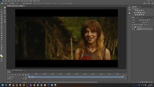
this next part should be made into an action.
at the top right of the timeline window, click four vertical lines to open the menu and select convert frames → flatten frames into clips. depending on how long the gif is, this can take a minute.
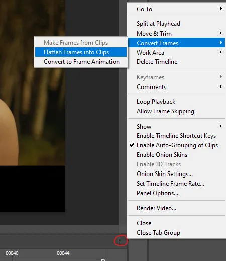
the layers panel should now look like this, each frame of the gif is now its own layer.
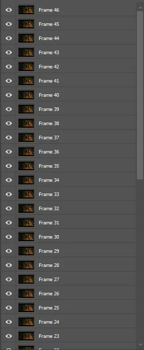
the very bottom layer will be the video group. this can be deleted as we’ve made the frames from it
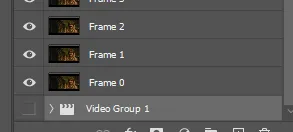
in same timeline menu as before, right under “flatten frames into clips”, select “convert to frame animation” and the screen should now look like this. this will be the end of this action.
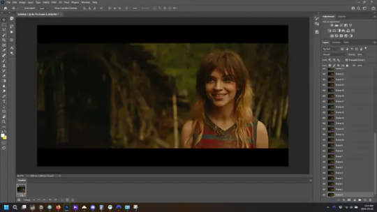
Cropping and Resizing
with widescreen footage, sometimes it’s just shorter than 1080p, but most of the time it will have the black bars on the top and bottom, and frustratingly, they’re not always the same size. it’s good to save the most common sizes as actions.
to find the size of the actual screen you turn on the rulers under view→rulers and check the height. then open your canvas size dialogue box under image→canvas size and change the height, making sure pixels are selected in the dropdown. yellowjackets is what i call “xtra wide” which is 800px. “normal” widescreen is 960px.
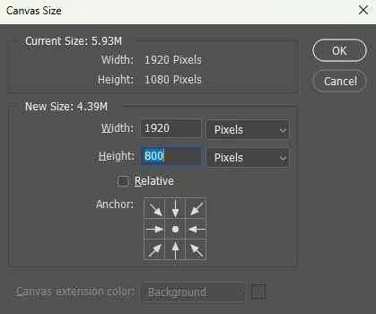
next we’re going to resize the caps. i also make actions for this, one for each potential gif size. open the image size dialogue box under image→image size and change the height of the image to your desired height plus 4 pixels. these extra pixels are to prevent a line at the top and/or bottom of your completed gif. now re-open the canvas size box, change the width to 540px, and the height to the desired, removing those 4 extra pixels. i have set this one to 540x540. this is where you would end the resizing action.
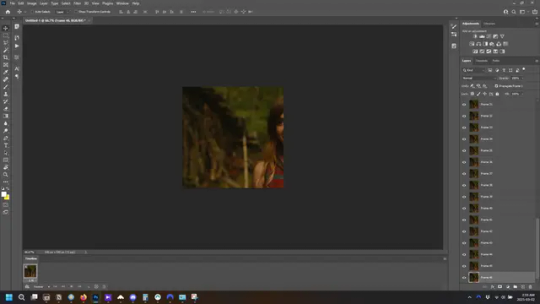
and as you can see she is off-screen. select the top layer, hold down shift and select the bottom layer to select them all, and with the move tool (the very top one) activated, click and drag to move it left to right as needed to centre the figure/s. as you move it a box will appear telling you how far you are moving it in any direction. make sure you are only moving it left or right, not up or down. to be certain of that, open the properties tab.
the y axis is your up/down, x is left/right. for this gif the y needs to stay at -98. you can also manually change the x axis number instead of dragging the image. also helpful for making sure multiple gifs of the same shot are all positioned the same.
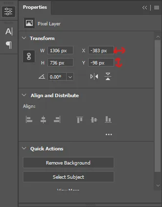
the layer are currently ordered with the 1st at the top and the last at the bottom. with all layers still selected, go to layers→arrange→reverse. the last layer will be on top now. if there is movement in your gif, check if you need to alter the position again to make sure the movement properly centred. but once you are satisfied with the position, the layers should be in “reverse” position, of last layer on top. this is to ensure that the gif plays forwards.
Converting Gif
this should also be made into an action, going through sharpening process
in the timeline menu, select “make frames from layers”
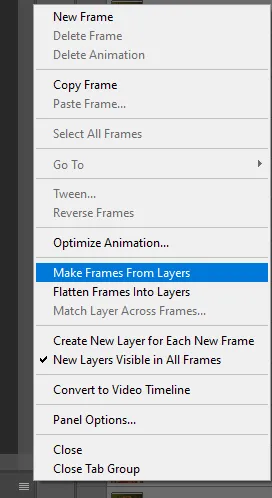
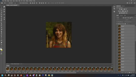
the frames are now populated in animation window. in timeline, click select all frames. go to any of the frames on the bottom and click the little arrow beneath it, select other, and enter 0.07 seconds. this is not a necessary step, as we will have to adjust the frame rate at the end, most likely to 0.05, but if we don’t change the frame rate here, then when we play the gif while working on it to check how it looks, it will play very fast.
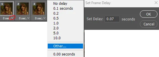
in the same menu at the right of the timeline box, select “convert to video timeline”
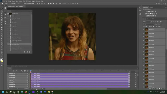
then, making sure all layers in the panel on the right are selected, go to filter→convert for smart filters. this turns all the layers into a single smart object.
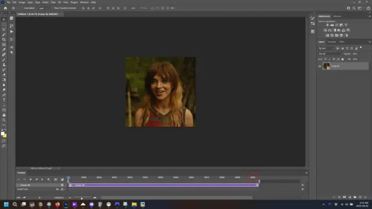
but if you look where i’ve circled, it says the gif is 99 frames long*, when in fact there are only 47. if you are making regular “scene” gifs, basic colouring and maybe a caption, this is fine and does not need to be fixed, it will play at the same speed. if you want to change it to display (approx.**) the correct number of frames, go to the timeline menu on the right, select “set timeline frame rate” and change it from 30 to 15
*if it does not list a frame number by 4 digits but instead says 5f, 10f, 15f, etc. go to the timeline menu on the right, select panel options, and change timeline units to “frame number”
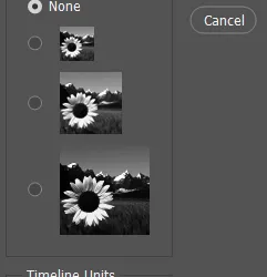
**the reason why this is only approximate is because the actual frame rate is not a a whole number, so when changing the frame rate it isn’t a 1:1, and 47 frames becomes 50 frames. the extra frames are removed at the very end, but if you are not doing any edits that require working frame by frame, there’s no need to change the frame rate here at all
Sharpening
this is, as it sounds, making the gif look sharper. to start go to filter→sharpen→smart sharpen and this window opens. play around with the dials to see what each ones does. the below settings are good for most high quality footage.
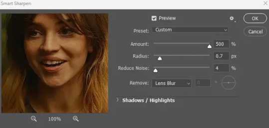
Amount-basically, how sharp do you want it
Radius-hard to explain, but this essentially sets how deep the lines of the sharpness are
Reduce Noise-smooths the pixels
once you click okay your single layer should look like this.
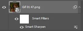
you’re going to then right click the layer and select duplicate layer. with the top layer selected, go to filters→blur→gaussian blur and set the radius to 1.0 pixels.
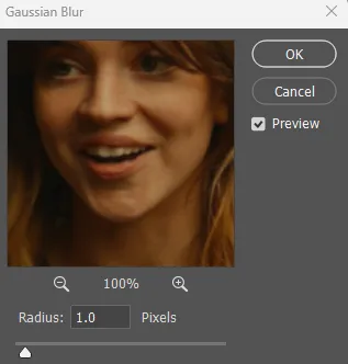
then change the opacity of the top layer to 10%. this is to essentially soften the sharpening a bit, as if it’s too sharp it can make the colouring wonky. this opacity level can also be changed depending on need.
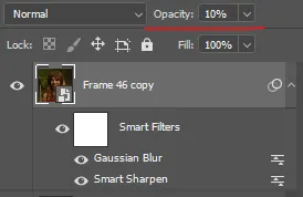
finally, select both layers, right click, and click “group from layers”. your gif is now fully made and sharpened.
Colouring
yeah. ran out of image space. but this is where you would do your colouring and add a caption or any other text.
Converting & Exporting
when all your colouring is done, you’re ready to start saving your gif. you can do it directly from your current file, but that means essentially losing your colouring, as all those layers will be merged together. i am someone who likes to save my psd’s (photoshop files), at least until i’ve posted the gifs, in case i need to fix something in the colouring. if you’d like to keep yours as well, open the history tab and select the first icon at the bottom “create new document from current state”. this will open a copy of the file in a new tab. save the original file and you can close it, continuing all work on the copy file.

select your all your layers, convert them into a smart object from filter->convert for smart filters, then follow the same steps from Creating Frames above. once you're back in frame animation, select Create Frames From Layers, and once again set the frame animation speed.
most people set the speed to 0.05. i personally set it to 0.05 or 0.06 depending on the length of the gif. check how it looks at 0.05, if it seems too fast, try 0.06.
now to save. go to file->export->save for web (legacy). the number is the lower left corner is your gif size, it needs to be under 10mb or else you'll have to delete some frames.

the right panel is your save options. the preset dropdown has some built-in settings, but you won't use them because (at least on my version) the presets only go up to 128 colours, instead of the full 256. the 3 i've highlighted in green are the only one's you'll adjust as needed. the settings below i use for i'd say 90% of my gifs. i'll sometimes change the adaptive dropdown to one of the other options, ocaissionaly the diffusion, and rarely the no transparency dither, but play around with them and see how they change the look of the gif.

when you're satisfied with the look of your gif, click save at the bottom right of the window.
voilà! you now have a gif.
Actions
this is your actions panel. the triangle on the left side is the button to open it. remember, if it's not already there, go to windows->actions to open it.
the buttons on the bottom, left to right, are stop recording, record action, play action, new folder, new action, and delete.

as you can see, i have different folders for my resizing, sharpening, captions, saving, and my 1 step (temporary) actions. to run an action is very simple; click the action, and click play.
to create an action, click the new action button, a box will pop up, give the action a name, and click record. the record button at the bottom of the action window will turn red. now perform all the steps you want it to record, and click stop recording. keep in mind it will record every single thing you do, including in other open files, so if the action you plan to record will have a lot of steps, it might help to write them down first.
to modify an action, select the step in the action above where you'd like the new step to be, hit record, perform the step, stop recording. select the step you'd like to delete, and click the delete button.
steps within the actions can be clicked and dragged, both within that action and moved to other actions. actions can also be moved between folders.
43 notes
·
View notes
Text
*taps the mic and laughs nervously because of the major stage fright*
Lizzington shippers, fam, grandmas and grandpas, can I have a moment of your attention, please?
It's not a secret that, while some people in Lizzington community are still active, whether they write or make gifs or keep our dash full of Lizzington even in this trying times ( @melbob26-blog, thank you for this! ), Lizzington community as a whole went into hibernation over the last couple of years.
And I get it, interests change, especially when one show ends and there's another ongoing, moving on from the show that ended is totally natural, especially when it didn't give your favorite characters the happy ending they deserved.
I get it.
Hell, for a pretty lengthy while there I focused on other ships and shows, too, especially after TBL ended ended last year.
But you know what I realized earlier today, when I reread some of the old fics, browsed through gifsets and text posts, watched some fanvids?
It's the show that ended, for some in 2021, for others in 2023. And the only thing that means is that it cannot disappoint us anymore.
( it's not like we were suddenly deprived of quality content, because let's face it, the fans have been the main source of the quality lizzington content for years now, while the show gave us mere crumbs, on a good day )
But Red and Liz?
They are still out there, fighting criminals, catching Blacklisters, travelling the world, shamelessly flirting, toppling shadow organizations, raising Agnes and/or any other children they have, and generally being the sexy badass power couple they are!
Nothing changed in that regard.
So why would we mourn them, when they are out there, healthy and happy and in the middle of yet another adventure? I'm sure right this moment Red is drawing Liz into another one of his heists and she's only too happy to join him, even though she pretends that she's not, for the sake of the game.
There's literally no reason for us to stop writing, giffing, editing, sharing theories and headcanons and memes and just talking about our favorite couple.
And by writing all of this, I want to propose something daring to you:
Let's revive the Lizzington community!
Let's rewatch earlier seasons and gif the hell out of them because it's been a while and because precious moments between these two are not going to become less precious even if it's giffed 10 or 100 more times, not to mention that ever gifmaker's style is different, so there are virtually no two identical gifsets as there are no two identical snow flakes.
Let's make fanvideos, picspams, picture edits, fanart, moodboards! The amount of songs, quotes, moments etc that can inspire you is virtually endless!
Let's write fics, let's explore AUs, let's give each other prompts and challenge each other to try something new or practice some aspect of writing, like writing kisses or AUs or hugs or making up Blacklisters etc!
Let's share headcanons and theories and ideas and what our versions of Red and Liz are like, because everyone has their own unique versions of Red and Liz living in their head, and it's just beautiful, if you ask me!
Let's reblog stuff, filling each other's dashes with Lizzington!
Let's scream about Lizzington because no one does it like them!
Let's revive the Lizzington Community, we all miss it!
PS. Feel free to reblog this post – spread the suggestion!)
PPS. To assure you that I'm not the type of person who encourages others but doesn't do anything themselves, I can tell you I've already got some ideas for a couple of Lizzington events in mind. Those include challenges, thematic weeks etc.
PPPS. I'm not sure how many people are checking the tags these days, so I'm gonna tag some people I know under the cut, just in case, to spread the suggestion. If you weren't tagged, trust me, it's nothing personal!
@meetmeatthecoda @iwouldlovetoeatyourtoast @agxntkeen @factoseintolerant @tale-xistime @james-baeder @lettie1609 @withwhatiam @peace-love-on-planet-earth @missourired @felilaprivada @strawberry-pills @roominthecastle @codewordpumpkin @my-robot-heart @kitkate91060 @imyourplusone @shelly1952 @itsjustme-itsmylife @castle2cute @nancyjocom @cress-26 @lunaarlilacs @femaleoptimistic @scifi-gk @greeneyedsoul88 @figureofdismay @shippinglizzington @kissthefuture @thetwistedargent @actuallylorelaigilmore @sorrydearie @turningtimeinthetardis @buildinggsr @apicturewithasmile @windfalling @piketrickfeet
#lizzington#raymond reddington#james spader#elizabeth keen#megan boone#elizared#elizabeth reddington#agnes keen#agnes reddington#agnesgate
84 notes
·
View notes
Text
I'm glad to have been on the right side of history for this moment.
In honour of the 7-day countdown and before this tag gets flooded by part 2 gifsets, analyses, and general insanity, I'd like to add to the Tumblr void my appreciation for Bridgerton S3.
Luke and Nicola, this whole season has been an absolute dream ❤️ I don't think you'll ever see this but I'll share it with the ones who love you as much as I do.
Thank you!
I know that the 2 previous couples weren't able to really showcase their chemistry and story because of Covid but thank you for the run-up and for introducing the world of Bridgerton to us. Thank you Phoebe, Rege, Jonny, and Simone.
Thank you to Shondaland and Netflix and the whole team/crew behind Bridgerton because the fantasy that you brought on TV is now more than than-- it is a lifestyle phenomenon.
To the cast that bring these characters to life, thank you for your patience and love for the show because that love is shown on screen and we audience appreciate your efforts.
To Julia Quinn for writing a whole family that represents the full range of love. And for sharing that to the world so we, too, can know the different facets of it.
And lastly, to my roman empire, the only reason I'll use this term--
to Luke and Nicola
THANK YOU.
For being the perfect Colin and Penelope. RMB is my favourite Bridgerton book so I was very excited to see them onscreen.
Thank you for advocating for us fans. Thank you for not making us feel ashamed for loving the steamy moments. Thank you for being so transparent about the love you have for Colin and Penelope. Your love translated well onscreen and it has made me fall in love even more with their love story.
Thank you for bringing your talent and a-game and for presenting one of the most beautiful love stories I've seen onscreen. This season has been so personal to me (same size as Nicola in height and weight, same type of height difference with my SO, and same demisexual tendencies as Colin).
Thank you for sacrificing 6 months of your life for the press tour. I can't imagine that being the easiest thing to do considering that you are both confessed introverts.
Thank you for giving a part of yourselves to each and every interview. Doing your best to be eloquent and witty even though you are exhausted from having to answer the same questions over and over. Your real life friendship made this press tour so so magical.
This maybe ending in a week's time but I will forever cherish the magic of Polin.
Thank you, Bridgerton Season 3 Polin. You will always be famous.


#polin supremacy#polin#bridgerton#netflix#nicola coughlan#luke newton#bridgerton seaosn 3#netflix bridgerton#bridgerton season three#bridgerton s3#bridgerton season 3#colin bridgerton#colin x penelope#penelope x colin#penelope featherington#colin and penelope#bridgeton season 3#bridgerton 3#penelope bridgerton#THANK YOU
76 notes
·
View notes